Should stock sectors be created equally? Are there some that consistently outperform and some that consistently underperform?
After my post on the historical performance (and outperformance) of different US stock style boxes I set out to see if a similar phenomena occurs with US stock sectors. Surely the least risky sector won’t also offer the highest performance like what happened with stock style boxes!? Well it does… and in this post we’ll go through the historical data, look at moving trends, calculate some risk metrics, look at the correlation matrix, offer some additional resources and point out some investment opportunities to consider.
Historical Annual Returns
Moving 3 Year Annualized Returns
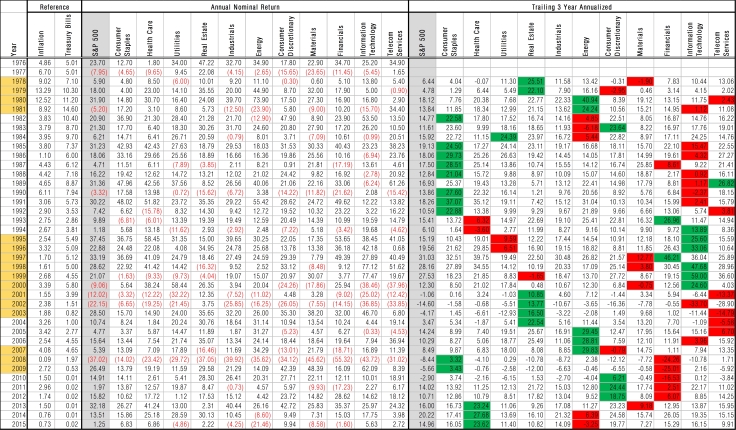
Below is a table of the annual returns of each sector compared to the overall S&P 500, treasury bills, and inflation for comparison. The data goes back to 1976, so it offers four decades of data. On the right I calculated the trailing 3 year annualized return so that we can start to discern some moving trends (best performing sector is highlighted green for that trailing 3 year period, worst is highlighted red). A couple things initially jump out, consumer staples was never the worst performing sector for a 3 year period. It was also the best performing sector for a number of 3 year periods. I like looking at 2008 because it was such a disastrous year; consumer staples lost “only” 14% that year though compared to the S&P which lost 37%. I also found the fact that industrials was never the best or worst sector relatively interesting and will be discussed later.
Moving 20 Year Annualized Returns
In the following table we take a look at the moving 20 year annualized return for each sector. I took the conditional formatting a step further too and highlight the best performing sector dark green, second best light green, second worst pink, and worst performing sector dark red. Look at how consistently consumer staples offered the highest or second highest performance in the trailing 20 year period!? And health care wasn’t too far behind.

Performance vs. Risk Metrics
Looking at annual returns and moving trends is helpful but now let’s define some risk metrics so that we can determine how well these sectors perform on a risk-adjusted basis.
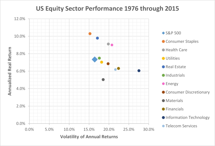
Volatility
To start let’s take a look at the performance of each sector plotted against what everyone else looks at, its volatility (the standard deviation of its annual returns). The returns are annualized real returns (after inflation); the S&P 500’s returns are around that 7% number investment professionals will tell you to benchmark for historical stock returns. But look at consumer staples/defensive! It is slightly less volatile than the overall market but offers 3% more annualized returns. You’ll also notice how well real estate performed and that might sound familiar because you’ll see REITs as a staple in many investment portfolios. There’s not much else to take from this plot other than the fact that health care and energy have also offered a great deal of outperformance.
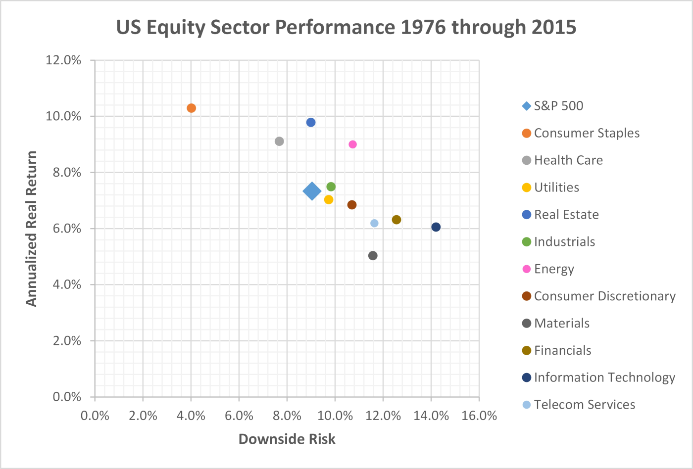
Downside Risk
Volatility is not the best metric to use for measuring risk. It penalizes stocks/sectors/funds that have fluctuating years of gains. Investors care about the frequency of how often they lost money and how severe those losses were. Dr. Frank Sortino in the 1980s recognized that volatility didn’t tell the full story on investment risk; so he developed a downside risk metric that is used in his Sortino ratio (see here for the math and more information behind the Sortino ratio.
If we plot the annualized returns against downside risk the picture becomes much clearer. Consumer staples moves WAY to the left (left means less risk). If you look back at the annual returns you’ll notice that consumer staples/defensive has only lost money 6 times over the last 40 years; and its worst year was a loss of 14%. It has a comparable risk level to long term treasuries yet an outperformance of 6% per year. The next thing that jumps out at me is how well health care has performed on a risk adjusted return level. Lastly materials, financials, technology, and telecommunications have offered dismal returns and required the investor to take on substantially more risk.
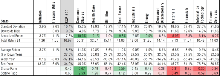
Sector Performance Summary
Below I’ve brought all the above data together in a clean summary table. All the data in the table is based upon real (after inflation) returns. Conditional formatting uses a color code to highlight the sectors annualized return relative to its peers. Similarly I color coded the sectors based upon their Sharpe ratio (volatility based) and Sortino ratio (downside risk based) that try to define the risk-adjusted returns of each asset class. A couple things jump out:
- Consumer staples/defensive, health care, and real estate offer substantially higher risk-adjusted returns than all other asset classes; this is especially true for consumer staples.
- Materials, financials, technology, and telecommunications are the opposite; they offer very poor risk-adjusted returns (they require the investor to take on more risk but offer less returns).
- Industrials, consumer discretionary, and energy seem to offer a fair amount of return for the risk they require.
Sector Correlation Matrix
I love correlations! I find them to be so telling about how different groups of asset classes “communicate” with each other. Below is the correlation matrix of the different US stock sectors, and I’ve included inflation, treasury bills, and of course the overall S&P 500 for comparison. I’ve summarized some take-aways below:
- Industrials is highly correlated to the overall stock market; this may be why it didn’t have any years of over or out performance. Consumer discretionary has the second highest correlation.
- Real estate on the other hand, along with utilities are highly uncorrelated to the overall stock market. This supports why you’ll hear that REITs are a good “diversifier” to a portfolio.
- The biggest thing I found though was that most of these sectors have very low correlations to one another. For example, consumer staples have a 0.22 correlation to real estate. This suggests that you can actually achieve better diversification by looking at sectors than what you can achieve by focusing only on global stock market diversification (global markets are becoming increasingly more correlated).
- Interesting note is the fairly high correlation energy has to inflation… makes sense. On that note, consumer stocks (both staples and discretionary) are negatively correlated to inflation.

Has Anyone Else Noticed This?
Like I was after looking at the returns of US stock classes; I am blown away by how I hadn’t heard about this sector outperformance. Why hasn’t this been something that is more readily discussed? Why don’t target date funds have a consumer staples “tilt?” Same is true for health care, these sectors have offered remarkably higher historical returns and required the investor to take on less risk. It again defies logic, such an inefficiency in the market should have been bought out and corrected. But it seemingly hasn’t and there is no indication that this will change.
A little digging did find a couple articles that discuss how well the consumer staples sector has done. And some of these articles mention health care’s run as well. One thing I found with my sector research though is how investment professionals seem so fixated on timing their sector weightings. It frustrates me so immensely that these relatively intelligent, yet over-payed, twits can’t seem to see the forest through the trees. They keep trying to pick individual “trees” and time everything; but history has shown that both approaches rarely can lead to lasting success.
- Dreyfus – The Long-Term Case for Consumer Staples
- Fidelity – 4 Reasons to Like Consumer Staples
- Pension Partners – Defense Wins Championships
- Investor’s Field Guide – The Best Performing Sector
- Fidelity – Sector Investing using the Business Cycle
- Goldman Sach’s – Stock Market Sector Streaks
- This is where I got some of the historical data. The article itself is another example of the financial community being interested in short term trends, not long term.
Why does Consumer Staples and Health Care Perform so well!?
The question is if these sectors “got lucky” or if they have an inherent characteristic that enables and even forces them to do so well. Both consumer staples and health care are “defensive” sectors (utilities is the third). Here’s what Morningstar has to say about defensive sectors:
The defensive super sector includes industries that are relatively immune to economic cycles. These industries provide services that consumers require in both good and bad times, such as healthcare and utilities. In general, the stocks in these industries have betas of less than 1.
These sectors have stocks that are reality immune to economic cycles… well that sounds attractive from an investment perspective! So the investment community has long known that these sectors are safer, they offer products and services that will always be needed by people, regardless of what’s going on in the general economy and global markets. So the only thing that these sectors require are people and for people to keep multiplying; I don’t think anyone is arguing against a continued global population growth. These sectors will continue their run.
When I’ve discussed this with friends of mine, many are surprised by how well consumer staples has done; and they generally agree this is a “safe” sector to invest in. But I get a lot of kickback on the healthcare front. People ask me if I’m concerned about increased regulations for health care companies.
We have to remember that any thing you, the retail investor, is worried about or heard about, so haven’t the big money managers. These guys have access to much more data than we do and their actions price the market appropriately for us. And they too are worried about regulations impacting the healthcare sector but… this has presented an opportunity!
Check out the below plot from Fidelity’s recent Q4 2016 sector update. Because everyone has been worried about increasing regulations for health care companies, this sector is historically undervalued. And based upon historical data, this suggests a higher chance of outperformance moving forward. You can take this with a grain of salt if you’d like; but always remember that the investment professionals know more than you do. But you can use this to your advantage if you keep a long term investment outlook. Use them to price companies appropriately for you in the short term that you can benefit from with your long term investment horizon!

Aren’t You Forgetting Real Estate?
I am admittedly acting fairly subdued in regard to the very attractive returns the real estate “sector” has offered; but there’s a caveat.
Real estate has long lived under the financials sector and was only just added as a new stand-alone sector. So the historical data had to come from REIT.com. Recent returns though came from Vanguard’s REIT index fund, VGSIX. And a closer look at the portfolio of VGSIX reveals that the real estate sector is actually not a large-cap sector; it’s mid-cap baby! And I’ve already shown how attractive the middle of a stock market/index to be.
This makes me wonder how much of real estate’s outsized risk-adjusted returns are due to being in the middle and not due to their sector. All the other sectors and historical data are showing the large-cap stocks in that sector; so the comparison is apples-to-apples there. But when we’re trying to compare REITs to the rest, I wonder if we’re doing an oranges-to-apples comparison by comparing a mid-cap sector to other large-cap sectors.
This doesn’t mean that I don’t think REITs are a good investment; but I want to do a proper oranges-to-oranges comparison. I can’t get a ton of historical data easily; but on the S&P 400 website we can take a look at the returns of real estate, health care, and consumer staples sectors of mid-cap over the last 10 years.

I know that 10 years isn’t a ton of time; but the insane outperformance of the mid-cap health care and consumer staples sectors in this time compared with REITs may be an indication that I’m on to something. Someday I’d love to break down the mid-cap sectors’ historical performance going back at least 20 years. But that will take a bit more digging…
Where to Invest?
Hopefully I’ve laid out a compelling case for considering an investment in these sectors. I wouldn’t necessarily suggest investing entirely in these two sectors (even though the historical risk-adjusted returns suggest that might be worthwhile); but they do warrant a 10% or 20% allocation to an already well diversified portfolio. Here are some options to consider:
- SPDR Sector ETFs – These are the most highly traded and therefore the most liquid, established in 1998
- Vanguard Sector ETFs – Low expense ratio (0.10%) and relatively high trading volume, established in 2004
- Fidelity Sector ETFs – Lowest expense ratio (0.084%) but new (2013) and therefore much less trading volume
There are many others that I won’t bother listing; but they’re out there. For folks that want a mutual fund (automatic reinvestment) the options are a little more limited. Vanguard is my favorite brokerage/fund provider but many of their sector mutual funds have a minimum investment of $100,000! Their health care and REIT funds have an option for “Investor Shares” that only require a minimum of $3,000; but they don’t have such an option for consumer staples unfortunately.
Fidelity has some long standing sector funds; but they’re actively managed. The nice thing with these is that they have low minimums ($2,500) so it’s fairly accessible to those with a Fidelity account. They do have expense ratios of 0.77% which is high; but in fairness to them, many have outperformed their respective benchmark. Still though, I don’t like investing in active funds. But below is the performance of their consumer staples and health care fund going back to 1985 compared to the S&P 500.

What about Mid-Cap Value?
The historical data of style boxes had shown how attractive mid-cap value and small-cap value to be. And after that analysis I changed the domestic portion of my portfolio to be entirely in those two asset classes; but the sector analysis changes things. Large-cap health care has similar risk-adjusted returns to mid-cap value and small-cap value. And large-cap consumer staples offers better risk-adjusted returns, considerably so.
On the outset this is actually kind of nice. Adding these two large-cap sectors helps round out my entire style box to be a little more similar to the total market (brings it a bit higher in market cap and a bit “right” in regard to growth/blend). And adding these sectors in addition to a portfolio of mid-cap value and small-cap value offers fantastic diversification benefits; the correlations of these sectors to mid value are less than 0.6 and to small value it’s less than 0.4!
But… I would love to double down and invest in an index that is comprised of companies that are in mid-cap value or small-cap value and in the consumer staples or health care sector. No such index or mutual fund exists; but I can build one and test the historical performance in Quantopian. In this post I do exactly this, and engineer my own index fund!

Disclosures
The author(s) of this site have no formal financial investing training or certifications. The content on this site is provided as general information only and should not be taken as investment advice. All site content shall not be construed as a recommendation to buy or sell any security or financial instrument, or to participate in any particular trading or investment strategy. The ideas expressed on this site are solely the opinions of the author(s) and do not necessarily represent the opinions of sponsors or firms affiliated with the author(s). The author may or may not have a position in any company or advertiser referenced above. Any action that you take as a result of information, analysis, or advertisement on this site is ultimately your responsibility. Consult your investment adviser before making any investment decisions. This site/blog contains the current opinions of the author; the author’s opinions are subject to change without notice. This site is for informational purposes only and should not be considered as investment advice or a recommendation of any particular security, strategy or investment product. The charts and comments are only the author’s view of market activity and aren’t recommendations to buy or sell any security. Market sectors and related ETFs are selected based on his opinion as to their importance in providing the viewer a comprehensive summary of market conditions for the featured period. Chart annotations aren’t predictive of any future market action rather they only demonstrate the author’s opinion as to a range of possibilities going forward. All material presented herein is believed to be reliable but we cannot attest to its accuracy. The information contained herein (including historical prices or values) has been obtained from sources that Engineered Portfolio considers to be reliable; however, Engineered Portfolio makes no representation as to, or accepts any responsibility or liability for, the accuracy or completeness of the information contained herein or any decision made or action taken by you or any third party in reliance upon the data. Some results are derived using historical estimations from available data. Investment recommendations may change and readers are urged to check with tax advisors before making any investment decisions. Opinions expressed in these reports may change without prior notice. This memorandum is based on information available to the public. No representation is made that it is accurate or complete. This memorandum is not an offer to buy or sell or a solicitation of an offer to buy or sell the securities mentioned. The investments discussed on this site/blog may be unsuitable for investors depending on their specific investment objectives and financial position. Past performance is not necessarily a guide to future performance. The price or value of the investments to which this report relates, either directly or indirectly, may fall or rise against the interest of investors. All prices and yields contained in this report are subject to change without notice. This information is based on hypothetical assumptions and is intended for illustrative purposes only. PAST PERFORMANCE DOES NOT GUARANTEE FUTURE RESULTS.

December 12, 2017 at 9:51 am
I am 24 years old and caught a lucky break me and my sweetheart are able to invest near Xk a month while I am in college full time for my engineering degree and this with sources and all is absolutely amazing. Consumer staples here I come thanks!
LikeLike
December 12, 2017 at 9:52 am
You need more followers
LikeLike
January 10, 2018 at 10:38 am
Note PSCC and PSCH.
LikeLike
January 17, 2018 at 6:41 pm
Great article. I came to this assumption also a few years ago and have been investing in XLP mostly since the. I wondered why the weighting of the consumer staples sector was not higher in the S&P 500 index but then realised that the index is recency biased in that it realises short term gains in its weighting. Interesting to note though that after a crash it is usually the staples sector that has climbed the most in sector weighting within the market from peak to trough. This shows its superiority during downturns but the most interesting fact is that it is the best performing sector period.
LikeLike
April 28, 2018 at 9:17 am
Dear fellow engineer view analyst
I see quite a variance on raw recorded numbers scattered in various sources (yours, fidelity’s, Goldman’s, etc.) for Annual % Return of the S&P500 11 Sectors & the S&P from 1976 todate. We value your inclusion of Infl. Rates & T. Bills. We don’t know which are more accurate and up-to-date?? Can you please supply us the link of your data, fidelity’s data or any other links and your opinion which is more credible for our thesis work. Your immediate response is greatly appreciated.
Sincerely yours
Konstantinos & Antonis
LikeLike
May 19, 2018 at 11:11 pm
Ive been using VHT & VDC instead if SPY for a few years now. Faber has some sector information dating back to 1929 and only 3 sectors beat the S&P (3rd was tech).
But the defensive sectors had the best Sharpe ratio (he didn’t list Sortino).
Something that would be interesting is analysing Large Cap momentum. MTUM has had a magnificent run and its index showed only a 40% max drawdown in 2007-08 which compares favorably to the S&P.
Would love to see an article on momentum as a factor.
LikeLike
June 5, 2018 at 10:04 pm
Good afternoon, like Konstantinos, I too am wondering about the source of your data. GICS only came into existence in 1999 so where did you get these returns? Would appreciate full transparency on this as I would like to use the data but want to verify its source.
Thank you!
Alex
LikeLike