
How efficient is the bond market? We’ve found inefficiencies within US sectors, size/style, and international stocks. Do similar inefficiencies exist in the bond market?
One would belief that fixed income should be easier to accurately predict returns and thus the bond/fixed-income market should be relatively efficient. In this post we’ll put this assumption to the test.
We’ll go through the annual returns of 11 different bond asset classes (and the S&P 500 and inflation for comparison) to analyze the performance of these bond assets. This analysis includes a look at the historical data (available to download here), comparison of moving trends, calculate 4 performance and 4 risk metrics, look at the correlation matrix, offer some additional resources and point out some investment opportunities to consider.
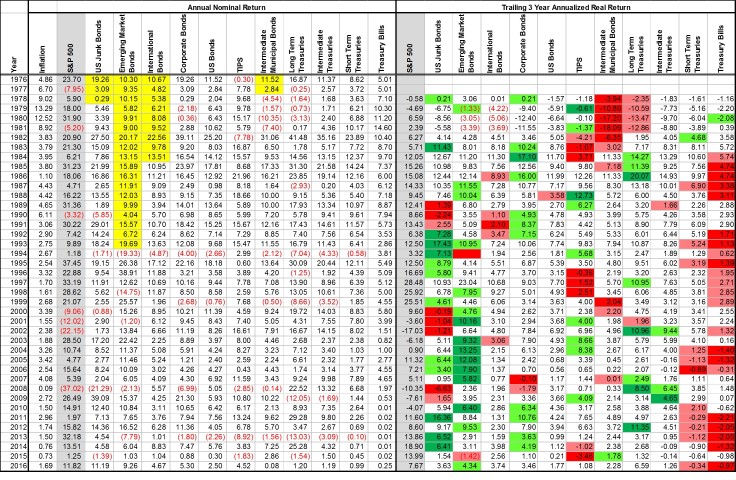
Annual Returns of Bonds
Trailing 3 Year Returns
The table below shows the annual returns of the 11 bond asset classes compared with the S&P 500 and inflation for comparison. A few years and asset classes are highlighted in yellow because the data does not extend that far back in history.
- Junk bonds uses corporate bond returns for 1976-1978
- Intermediate municipal bonds use aggregate US bond returns for 1976-1977
- International bonds use 90% US bond, 10% international stock
- Emerging market bonds use 90% international bonds, 10% emerging markets
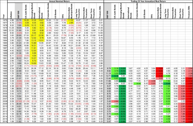
Trailing 20 Year Returns
Below is the same table; but now with the trailing 20 year returns. Immediately emerging market bonds (even after our fabricated returns stretch) significantly outperform on a consistent basis. Long term treasuries also seem to do well consistently.
Risk Adjusted Performance
With any investment analysis, looking at the overall returns (and trailing returns) is not a fair way to quantify performance. What we really want to conclude is if one asset class is exhibiting higher risk-adjusted returns than another. Many investment professionals will traditionally use only one metric to define risk and another to define return performance. In this post we’ll look at 4 different pairings to gain a deeper understanding of how these asset classes perform.
Average Return vs Volatility of Returns
The most common plot you’ll see when analyzing investment performance is the annual average return vs the standard deviation of those annual returns. Markowitz pioneered the mathematics behind quantifying investment returns on these metrics; but more importantly, he showed that one can calculate the efficient asset allocation given these metrics and the correlations. Because of his work done in the 1950s, investment professionals still tend to solely rely on these metrics to quantify risk/return.
In doing so, the bond market appears fairly efficient. Note that the results shown are real returns (after inflation). Municipal bonds look poor but, this is showing pre-tax returns – municipal bonds fair much better in after tax returns.

Annualized Return vs Downside Risk
Volatility is not the best metric to use for measuring risk. It penalizes assets that have fluctuating years of gains. Investors care about the frequency of how often they lost money and how severe those losses were. Dr. Frank Sortino in the 1980s recognized that volatility didn’t tell the full story on investment risk; so he developed a downside risk metric that is used in his Sortino ratio (see here for the math and more information behind the Sortino ratio.
If we plot the annualized returns against downside risk we can start to see how efficient the bond market truly is. In the plot, there a number of assets that are skewed to the right (indicating inefficiency); but notice the big green circle in the upper left. That big green circle is the total US bond market meaning that it holds allocations in all those other circles/asset classes.

Trailing 10 Year Returns Average vs Volatility
Those last two plots fail in showing how consistent the asset class performs. The overall metrics could be skewed from a handful of very good or very bad years. In an effort to quantify how consistent an asset class performs, I’ve plotted the average 10 year real annualized return vs the volatility of those returns.
Again we see that big green data point (aggregate bonds) at the inflection point on the upper left indicating that it is offering maximum efficiency… at least for the US bonds. Emerging market bond returns become even more compelling and international bonds also appear to offer unique performance benefits.

Worst 15 Year Return vs Maximum Drawdown
Now let’s look a doomsday scenario and plot the worst trailing 15 year return against the largest drawdown. In this plot you notice a couple telling things:
- Although emerging market bonds are volatile, if you give them a bit of time they do the best job at preserving capital and limiting losses.
- TIPS (treasury inflation protected securities) also do an excellent job at preserving capital compared to other bond asset classes. This makes sense because bonds traditionally lose money to inflation, which TIPS tries to mitigate.
- Cash isn’t as safe as you may assume. The worst 15 year performance of treasury bills (the equivalent of a bank savings account, although probably slightly better) is a -1% annualized return (or loss) against inflation. That’s bad! This will be the topic of a future post; but cash savings are not what they are made out to be – an efficient safe asset allocation has historically done a better job at preserving capital when inflation is considered than just keeping it in the bank.

Performance Summary
The table below summarizes the data presented in the preceding tables and figures. I used conditional formatting to highlight how well these asset classes performed on a risk adjusted basis relative to their peers. A couple takeaways:
- Emerging market bonds, although risky, offer superior risk-adjusted returns
- International bonds also offer good risk adjusted returns
- In the US, aggregate bonds are very good at capturing the overall returns and therefore provide an efficient means of investing in the entire bond market
- Municipal bonds don’t look appealing; but these results have all been on a pre-tax basis. With taxes considered, the returns of munis will be more attractive.
- TIPS are stable and a good preserver of capital
- Long term treasuries are risky… when not invested in stocks as well

Correlation Matrix
After reviewing these previous plots/tables I originally came to the conclusion that long term treasuries are way too risky to actually consider investing in. But when we take a look at the correlation, and lack thereof, to stocks we can start to see how they could provide a significant benefit over just owning an aggregate bond index.

- Of bonds, long term treasuries offer the diversification benefit to a portfolio of mostly stocks
- Junk (high-yield) and corporate bonds on the other hand are very highly correlated to the returns of stocks. This suggests that they don’t help for most investors that have stock holdings
- Municipal bonds are highly uncorrelated with inflation. Therefore, in time of high inflation, these bonds tend to get punished the most. This suggests that municipal bond investors should be sure to also invest in inflation hedges (energy stocks, gold, etc.)
- Treasury bills historically are highly correlated to inflation. When inflation is higher, your cash savings account will return more; when inflation is low – you’ll get a lower dividend in your savings account. But on average, one can only expect about a 1% besting of inflation with such an investment – and it isn’t guaranteed.
Conclusion
The bond market is fairly efficient, meaning that an investment in aggregate bonds will do a very good job at efficiently allocating across the various bond asset classes. But… this doesn’t take into account what happens when invested in stocks as well. As we’ll see in the next couple posts, certain bond asset classes offer an attractive hedge to stocks even though they don’t look good on their own or in an ultra conservative account.
I encourage you to download the data used in this analysis to draw your own conclusions too!

Disclosures
The author(s) of this site have no formal financial investing training or certifications. The content on this site is provided as general information only and should not be taken as investment advice. All site content shall not be construed as a recommendation to buy or sell any security or financial instrument, or to participate in any particular trading or investment strategy. The ideas expressed on this site are solely the opinions of the author(s) and do not necessarily represent the opinions of sponsors or firms affiliated with the author(s). The author may or may not have a position in any company or advertiser referenced above. Any action that you take as a result of information, analysis, or advertisement on this site is ultimately your responsibility. Consult your investment adviser before making any investment decisions. This site/blog contains the current opinions of the author; the author’s opinions are subject to change without notice. This site is for informational purposes only and should not be considered as investment advice or a recommendation of any particular security, strategy or investment product. The charts and comments are only the author’s view of market activity and aren’t recommendations to buy or sell any security. Market sectors and related ETFs are selected based on his opinion as to their importance in providing the viewer a comprehensive summary of market conditions for the featured period. Chart annotations aren’t predictive of any future market action rather they only demonstrate the author’s opinion as to a range of possibilities going forward. All material presented herein is believed to be reliable but we cannot attest to its accuracy. The information contained herein (including historical prices or values) has been obtained from sources that Engineered Portfolio considers to be reliable; however, Engineered Portfolio makes no representation as to, or accepts any responsibility or liability for, the accuracy or completeness of the information contained herein or any decision made or action taken by you or any third party in reliance upon the data. Some results are derived using historical estimations from available data. Investment recommendations may change and readers are urged to check with tax advisors before making any investment decisions. Opinions expressed in these reports may change without prior notice. This memorandum is based on information available to the public. No representation is made that it is accurate or complete. This memorandum is not an offer to buy or sell or a solicitation of an offer to buy or sell the securities mentioned. The investments discussed on this site/blog may be unsuitable for investors depending on their specific investment objectives and financial position. Past performance is not necessarily a guide to future performance. The price or value of the investments to which this report relates, either directly or indirectly, may fall or rise against the interest of investors. All prices and yields contained in this report are subject to change without notice. This information is based on hypothetical assumptions and is intended for illustrative purposes only. PAST PERFORMANCE DOES NOT GUARANTEE FUTURE RESULTS.

May 23, 2018 at 10:50 pm
Coud you comment more about municipal bonds being held in taxable accounts. Your engineered portfolios do not make the distinction between taxable and tax free accounts.
I know that it is difficult to determine due to various tax brackets but I am sure software can run an analysis at which tax bracket municipal bonds begin to make more sense.
LikeLike
July 31, 2018 at 5:31 pm
hello,
what is “us bond” category, is it “us government bond” and can you please give me a fund and etf name for this.
thanks, Rob
LikeLike
September 3, 2018 at 7:28 am
Hi! Could you clarify whether these returns you have calculated (esp. for bonds) are purely the yield, or do you include the mark-to-market gains/losses on the value of the bonds? i.e. are these total returns?
LikeLike