
After my post on ex-US stock asset classes, I started to wonder if there are particular specific countries that have attractive stock market.
Finding the historical returns of many different country stock markets would have been a tedious task; but thankfully the team at Credit Suisse does a summary of world equities every year in their annual yearbook!
In this post I’ll summarize the Credit Suisse yearbook and then dive a bit deeper into the returns of 4 different stock markets: the United States, Australia, Sweden, and South Africa. All the data presented is available to view and analyze yourself, and we encourage you to do that!
A Nod to Credit Suisse
Before we jump in and analyze the data presented by Credit Suisse in their annual yearbook. I’d like to highlight the report in general. It is stock full of interesting commentary and analysis. They also present and analyze bond performance that I won’t discuss in this blog but it is interesting. One of the big themes they stress is to not have a “success bias” by always looking at the US stock market, an apparent anomaly in relation to the rest of the world.
Breakdown of World Stock Market
Let’s start by reviewing the component of the overall global stock market that each country makes up. We think in the US that our stock market is the best, and this blog may start to persuade you otherwise. But no one can argue that the size of the US stock market is unparalleled.
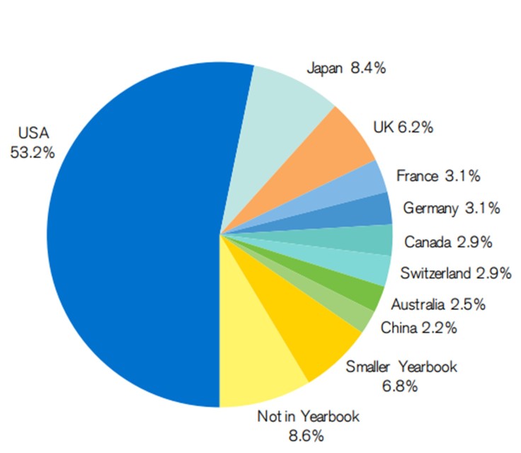
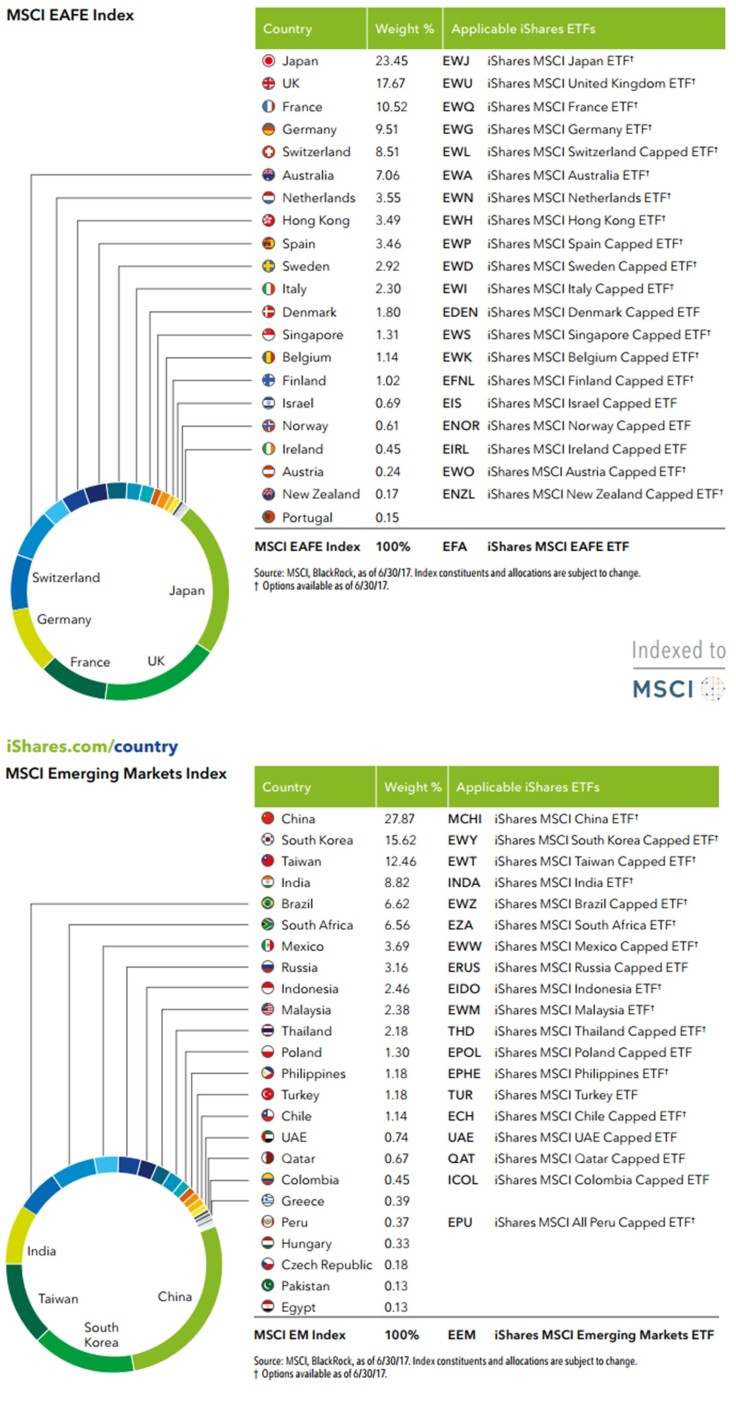
The US stock market still makes up a majority of the entire world’s (publicly traded) stock market. To dive in deeper to the breakdown by country, excluding the US, I looked at the iShares country ETFs. These breakout the MSCI EAFE (designed to measure the equity market performance of developed markets outside of the U.S. & Canada) and emerging market indexes.
Returns Data by Country
Real Returns of 21 Different Countries – 1900 through 2016
Now let’s take a look at the return metrics and risk metric (defined by standard deviation of returns) for a very long time period – 1900 through the end of 2016!

Right of the bat, you may be surprised that the United States is not the best stock market across the world, even when looking at the risk adjusted returns!
Country Returns for Different Time Periods
1900 through the end of 2016 is a very long time; so let’s take a look at the returns of these various countries over a more recent time horizon. Some interesting countries start to emerge as dominant forces when looking at the period of 1967 through the end of 2017. Most notably Sweden and South Africa start to jump out at me.

I immediately gravitated towards South Africa, Sweden, and Australia for a couple reasons:
- Most obvious is how well the performed in all 3 of our time periods
- They seem to consistently be outperforming the global markets
- They have good risk adjusted metrics
- They are geographically diversified (think the four corners of the world when including the US too)
Annual Returns
I went and pulled the annual returns data I could find for these three countries compared to the US. In recent years I could use the iShares ETFs for returns. But I had to do some digging for the older data:
- Sweden: House Prices, Stock Returns, National Accounts, and the Riksbank Balance Sheet
- Australia: The historical equity risk premium in Australia
- South Africa: FTSE Index Returns by Year
I used the expense ratio of the respective iShares ETFs (EWD, EWA, EZA) to reduce the returns and get a better indication of what an investor would have received.

What jumps out at me is how often the US is the worse of the 4 countries. The most notable exception is recent times the US has far exceeded international equities, including our 3 country focuses – expect a bit of mean reversion here over the next couple years.
Risk Metrics
Now I’ve computed a few performance and risk metrics to try and compare these country stock markets on a risk adjusted basis. In nearly every category, one of the other three countries is beating the US, except when only looking at average return vs volatility of returns – the US appears to exhibit a fair risk adjusted returns although it has less returns than the other countries.

Country Background
Australia
According to Credit Suisse, Australia is the “Lucky Country:”
Australia is often described as “The Lucky Country” with reference to its natural resources, weather, and distance from problems elsewhere in the world. But maybe Australians make their own luck.
Of the three alternatives to the US, Australia is the largest stock market and therefore it has a much higher correlation to the general EAFE index – this may make it not as desirable as a tilt in our portfolio.
Sweden
I like Sweden. They offer some unique benefits, according to Credit Suisse –
Swedish equity returns were supported by a policy of neutrality through two world wars, the benefits of resource wealth, and the development of industrial holding companies in the 1980s. Overall, equities returned 5.9% per year in real terms.
Sweden has a wealth of natural resources, they’re part of Europe but tucked up in the corner a bit out of the way, they are a well educated people, and clearly their stock market returns have been attractive. They only represent 3% of the EAFE index, so there could be some diversification benefit of adding a tilt here.
South Africa
Referred to as the “golden opportunity” by Credit Suisse due to their abundance of gold and other natural resources. Their stock market is very well established (since 1886) for still be referred to as an emerging market. They do have a large poor population and need to improve the education and integration of these people into the economy. But this represents another significant resource that South Africa has – untapped potential in their people.
What’s also nice about South Africa is where they are geographically located – in Africa and an entrance into many of the “frontier markets” there. Their dependence on precious metals and gold has also generated some unique benefits in that they offer quite a bit more diversification to other stock asset classes.
Bringing it All Together
When we added these countries as options to consider in our optimizer the optimizer loved adding these countries – so much so that we actually had to limit the maximum weighting to 10%. We didn’t feel comfortable suggesting portfolios with significant tilts to South Africa and Sweden; but we couldn’t deny that the data spoke for itself and justified a small tilt!
Why are they so desirable? It is due to the fact that not only did these countries perform well overall, they did so by moving to the beat of their own drum. Take a look again at the correlation matrix.

There you have it, our data suggests that small tilts to South Africa and Sweden to be worthwhile! Although the US stock market is the most talked about and generally considered the best… I’d argue that the data suggests some other countries, namely South Africa and Sweden, have better stock markets – they at least warrant your consideration.
But I encourage you to download the data used in this analysis to draw your own conclusions too!

Disclosures
The author(s) of this site have no formal financial investing training or certifications. The content on this site is provided as general information only and should not be taken as investment advice. All site content shall not be construed as a recommendation to buy or sell any security or financial instrument, or to participate in any particular trading or investment strategy. The ideas expressed on this site are solely the opinions of the author(s) and do not necessarily represent the opinions of sponsors or firms affiliated with the author(s). The author may or may not have a position in any company or advertiser referenced above. Any action that you take as a result of information, analysis, or advertisement on this site is ultimately your responsibility. Consult your investment adviser before making any investment decisions. This site/blog contains the current opinions of the author; the author’s opinions are subject to change without notice. This site is for informational purposes only and should not be considered as investment advice or a recommendation of any particular security, strategy or investment product. The charts and comments are only the author’s view of market activity and aren’t recommendations to buy or sell any security. Market sectors and related ETFs are selected based on his opinion as to their importance in providing the viewer a comprehensive summary of market conditions for the featured period. Chart annotations aren’t predictive of any future market action rather they only demonstrate the author’s opinion as to a range of possibilities going forward. All material presented herein is believed to be reliable but we cannot attest to its accuracy. The information contained herein (including historical prices or values) has been obtained from sources that Engineered Portfolio considers to be reliable; however, Engineered Portfolio makes no representation as to, or accepts any responsibility or liability for, the accuracy or completeness of the information contained herein or any decision made or action taken by you or any third party in reliance upon the data. Some results are derived using historical estimations from available data. Investment recommendations may change and readers are urged to check with tax advisors before making any investment decisions. Opinions expressed in these reports may change without prior notice. This memorandum is based on information available to the public. No representation is made that it is accurate or complete. This memorandum is not an offer to buy or sell or a solicitation of an offer to buy or sell the securities mentioned. The investments discussed on this site/blog may be unsuitable for investors depending on their specific investment objectives and financial position. Past performance is not necessarily a guide to future performance. The price or value of the investments to which this report relates, either directly or indirectly, may fall or rise against the interest of investors. All prices and yields contained in this report are subject to change without notice. This information is based on hypothetical assumptions and is intended for illustrative purposes only. PAST PERFORMANCE DOES NOT GUARANTEE FUTURE RESULTS.

October 7, 2017 at 2:13 am
Ewd etf started the year 2000 around $30 and stayed below $30 in 2016. How did you get real annual returns of 5% for the swedish index for that period? Great website by the way.
LikeLike
October 9, 2017 at 2:23 pm
Serdar,
Great question, and thank you for the kind words on our site. I got the data from Yahoo finance. You’re right that the price data doesn’t look that impressive; but EWD has paid a healthy dividend that has allowed the ETF to compound fairly nicely.
I created a Google Sheet that has the yahoo data along with a plot that shows the adjusted close price compared to the raw ETF price. With dividends the ETF has returned 87% since the start of 2000, without dividends it’s lost 5%… dividends matter a lot in the long run!
LikeLike
April 1, 2018 at 1:18 am
Hello. Nice website, looks like you’ve done a lot of research. I noticed however that the returns on non-US equities you’ve built your calculations on do not seem to account for currency fluctuations. The ETF’s quoted in the Engineered Portfolio are not currency hedged, nor is the raw stock market data. Am I missing something?
South Africa has seen a massive devaluation of it’s currency in the past few decades, so it makes sense that the returns on the Johannesburg Stock Exchange would have to be significantly greater than a US dollar denominated exchange.
Checking the Engineered Portfolio on Portfolio Visualizer, it significantly under performs the S&P500. Link to results below:
https://www.portfoliovisualizer.com/backtest-portfolio?s=y&timePeriod=4&startYear=1985&firstMonth=1&endYear=2018&lastMonth=12&endDate=03%2F31%2F2018&initialAmount=10000&annualOperation=0&annualAdjustment=0&inflationAdjusted=true&annualPercentage=0.0&frequency=4&rebalanceType=1&showYield=false&reinvestDividends=true&benchmark=VFINX&symbol1=VSS&allocation1_1=20&symbol2=VOE&allocation2_1=20&symbol3=VWO&allocation3_1=20&symbol4=VDC&allocation4_1=20&symbol5=EZA&allocation5_1=10&symbol6=EWD&allocation6_1=10
LikeLike