
How much money do you aim to have by when and why? How will you achieve that goal? In this post I will share my vision and plan with specific investment strategies while posing questions to you to help you envision your own financial future and take steps to get there.
At the age of 28 when I started this blog with my former boss, Chris, and lifelong friend, I aimed to find an optimal investment portfolio. I had fun and learned some valuable insights (my 11 posts); but all my analysis and posts were too myopic – they focused on one investment mix. Chris was a bit ahead of me, maybe because he is 8 years older, and started writing about a comprehensive investment strategy of strategies (Chris’s 6 posts). But I haven’t posted anything here for over 7 years, since May 2018! What have I been up to, have I learned any valuable financial lessons worth sharing? Yes!!
After maturing to now 37, having 2 more kids (4 total), buying/selling some homes, getting another masters degree, experiencing a global epidemic, changing companies, starting a philosophical blog on the meaning of life, and living more life myself – I’ve developed and want to share my family’s comprehensive financial plan in this post (while obscuring the absolute values). I’ll share how I arrived at these allocations and strategies to provoke you to consider yours with suggested ranges based on my life experiences. I hope this inspires you to document your own plan, align with your partner on it, and go achieve your financial dreams!
Like all my posts, this has gotten a bit out of hand in length so here’s a table of contents and outline on what to expect with anchor links to each section.
- Quantify Your Goal and Chart Your Course. Choose from Many Different Savings Paths. Appreciate the Outsized Impact of Good Investment Performance.
- Develop Your Investment Strategy of Strategies. Establish Rules to Abide By. Diversify Across Strategies. Leverage Index Target Date Funds to “Tie” the Benchmark. Use an “All-Weather” Portfolio to Stabilize Your Returns and Give You Peace of Mind. Benefit from a Momentum Strategy’s “Different” Movements. Scratch Your Itch with a Small Mad Money Account(s).
- Put Cash to Work, But Not Enough to Drag Your Returns. Keep at Least 3 Months Worth of Spending in Cash Equivalents, Not Sitting in a Bank. Deploy Cash During Market Downturns. Apply Dollar Cost Averaging to Overcome Your Hesitancy.
- Live a Life Worth Living in Appreciable Assets. Consider the Home Ownership and Rental Costs in your Desired Real Estate Market. Project Your Net Worth Growth from Buying a Primary Residence. Decide What Will Bring You More Joy at your Current Stage of Life.
- Prepare the Next Generation. Pay for College with a 529 Plan. Teach Your Kids Investing with a Custodial Roth IRA.
- Keep The Discussion and Learning Going!
To also help those that want a quick glance through this long blog, here’s a presentation form of the content. And for those that want to dive deeper, you can view all the data in this Google Sheet and interactive plots with the Python code that generated it here in this Google Colab.
Quantify Your Goal and Chart Your Course
I envision when our investable assets generate enough income to cover our expenses, freeing us to pursue our passions with confidence our children can pursue theirs. That’s my vision! To quantify it, I need to understand how much money I will likely spend in or near retirement and then target a total investment portfolio value 25 times larger (so that 4% will cover expenses). This is in addition to equity in property which will contribute to net worth gains but not (likely) provide any liquid income. I hope to reach this point by the time I’m 60 so I can be present and helpful for my young adult children as they start their own families.
Understanding what this number is to reach and by when will help you build a plot like this, that assumes the more typical retirement age of 65. I’ve added a third line though, the value of your investment portfolio that will allow it to grow with no more contributions, yet reach a value 25x your annual spending in time for retirement. This equation is target = 25/1.06^years_left (assuming 6% return) and quantifies when you’ve reached a point of financial flexibility or “cruise control.”
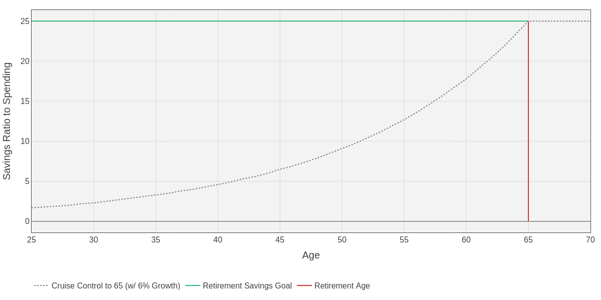
I recommend you update this plot every year (what’s the target balance, age, and cruise control line) and then add a point representing where you currently stand on it. If you’re approaching or above that “cruise control” line (like I am) then it may be time to consider one or both of two things:
- Make a change in your career to one less stressful which will reduce the amount of savings you generate or stop it all together.
- Put money into home equity for an updated or different home which will reduce the amount of investable assets you have (like I am considering).
Choose from Many Savings Paths
With a firm understanding of where you are today and where you aim to be in the future, now you need to plan the steps you’ll take. There are an infinite number of paths to take, but I’ve simplified it to four extremes. Each reach the same end point but take vastly different routes. Consider four people:
- Steady Eddy – Steady career with little-to-no debt at the start but saves 10% diligently from 25 to 65 years old when they retire (think bluer collar jobs).
- High Earner Werner – Starts with a lot of debt at the start to pay for their degrees but they make a lot of money in their 40s and beyond, saving 15% along the way to retire at 65 (think doctors, lawyers, etc.).
- Early Riser Taylor – Starts with some debt but quickly starts making and saving a lot of money, 20% of their income from the start which enables them to settle into cruise control at 45 and retire at 60 (think engineers, scientists, finance, etc.).
- Thrifty Christie – Starts with some debt but lives well below their means to save 40% of their income to retire at 55 years old, abiding by the Financial Independence, Retire Early (FIRE) philosophy.
I’ve compared the assumptions and projected each personas savings over time in this spreadsheet. Each of them are expecting to spend $100K annually in retirement (meaning they seek $2.5M in assets) and benefit from 7% annual gains on investments leading up to retirement. But they take very different approaches to saving and earning income along the way, yet they reach the same point. The following plot visualizes each individuals path of earning, contributing, and growing their savings. I want you to take two main takeaways from this. (1) Each path is unique yet not mutually exclusive, and can arrive at the same point. (2) Saving, especially early, can appreciate to a point that it makes later contributions negligible, no matter how much money you make later.
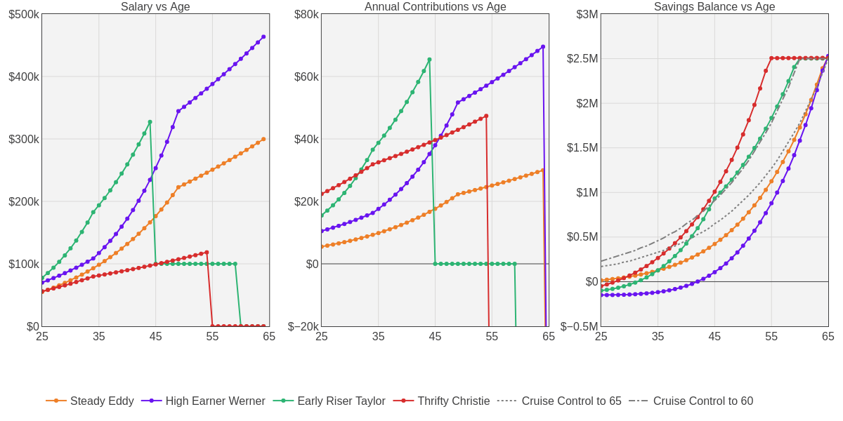
Sharing candidly, I’m most like Early Riser Taylor which I suspect Chris is also. My biggest fear isn’t if I’ll make it to that cruise control line, its worrying that I’ll get there and become too blinded and ambitious to take action. Much of the motivation to write and publish this blog was to hold myself accountable and to enable my young adult children ~10 years from now to do the same! I hope by the time I’m 50, I have the opportunity and choose to shift my career toward somethings serving society more directly, while freeing more time and energy to shift from my career toward my family.
But there isn’t one single “right” persona to try and copy. You must determine your unique path, considering your career and lifestyle you’d like along the way toward and then in retirement. Life has ups and downs, its okay to flex up and down your savings as necessary. Just pay attention and always reassess along the way about what path you want to take, and what the next couple steps need to be.
Appreciate the Outsized Impact of Good Investment Performance
In the above four personas I kept the market performance and final balance fixed, just changed the paths. But market performance of 7% is not a given, it must be earned! Not only must it be earned, but improving your investment performance has a proportionally higher impact on your final balance compared to increasing your contributions along the way. I’ll use the following scenarios to illustrate this point, but given the same starting point know that: investment performance >> contribution % > salary growth.
Let’s consider you as someone starting to save at 25 years old with no debt, but also no savings yet. In this example, you will start with a salary of $50,000. We’ll vary each of the following variables +/- 33%.
- Salary Growth (4%, 6%, 8%) – Resulting in a salary at the age of 64 of $172K, $272K, or $427K. (I assumed only a 2% gain in salary from age 50 onward regardless of scenario).
- Contribution Percentage (10%, 15%, 20%)
- Investment Performance (4%, 6%, 8%)
Visualizing the impact of three input variables in two dimensions isn’t easy! So I went with this approach of generating 9 sensitivity tables showing the balance at 65, each fixing one of the variables at a single value while varying the other variables +/- 33%. I’ll give you a moment to study it… there’s a lot there! Notice how going down along the first column (increasing salary) looks pretty similar to going down along the second column (increasing contribution %). But the biggest jumps come from going down along the third column (increasing investment performance).
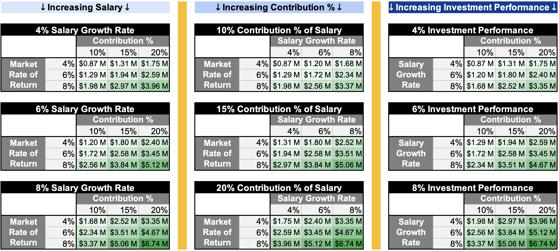
To hammer this home, lets start with the “worst” case scenario, when your salary grows at 4%, you contribute 10% of your salary, and your savings grows at 4% annually. You’ll reach retirement at 65 with $0.87M. If you double your salary growth to 8%, you’ll retire with $1.68M. If, instead, you double your contributions to 20%, you’ll retire with $1.75M. But if, instead, you doubled your investment performance while keeping everything else constant, you’ll retire with $1.98M. Let’s plot the above four scenarios, plus one where you were at the midpoint of each variable (6% salary growth, 15% contributions, and 6% investment performance. And finally we’ll add a sixth scenario where you maximize each variable (8%, 20%, 8%). Here’s the data, and here’s the Python code for the plots.
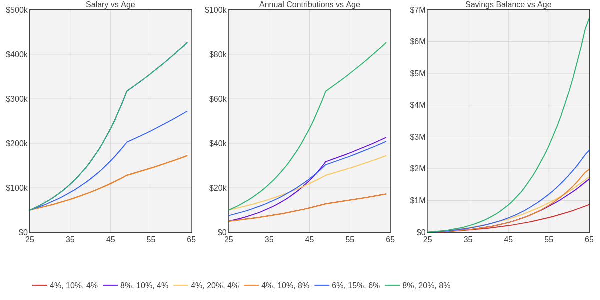
Your salary growth clearly matters, but the percentage of that salary you’re able to contribute matters more. And above all, the investment performance matters the most. Investment performance >> Contribution % > Salary Growth. So… how should we maximize investment performance!?
Develop Your Investment Strategy of Strategies
Maximizing your investment performance depends on two things:
- Your specific investment portfolio composition and plan to adjust given a set of rules
- Your ability to stick to the plan
I believe that the ability to stick to your documented plan matters more than the specifics of your plan because it removes your caveman investment brain from the equation which will likely depend too much on emotion, have recency bias, and have an inflated ego. I’ll share my plan here which is one I developed for my family, I’m not asserting its right for everyone! But hopefully by sharing the logic I applied to these decisions you can make sure you develop a plan that you will have conviction in as being the right one for your family!
Establish Rules to Abide By
Always important to start with some tenets! When needing to make a decision with limited data, what rules will you use to arrive at the right answer? Here are my investment tenets, think through your own!
- Accurate reporting beats pride. Telling yourself and your spouse the truth about your goals and performance may hurt sometimes; but it will pay dividends in the future for you both.
- Keep it simple yet fun. Enable yourself to stick to the plan. But empower yourself to act.
- Learn enough to pay minimally. Teach yourself what’s needed to avoid fees and taxes at all costs.
- Apply good investment theory to your unique self. Data helps, but only you know yourself well enough to use it in a way that benefits your needs.
- Maximize your impact, not your wealth. Money is a means to an end. Use it or give it away.
I think these are self explanatory but I’ll reference them throughout the next few sections to highlight the value in establishing and abiding by a set of simple tenets!
Diversify Across Strategies
The following table lists my target allocation for the different investment strategies I embrace across my portfolio of portfolios. Note that this just represents the percentage of my investable assets, which I target to be about 50% of my overall net worth. So at any point, I expect that for the total amount of money I have across these strategies/portfolios, I also own a comparable amount of home equity. I added a column to suggest a range for you to consider setting a target allocation within. The rows are ordered according to their risk level, cash is the safest, a mad money account is the riskiest.
| Strategy / Type | My Target Allocation | Recommended Allocation |
|---|---|---|
| Cash | 5% | 0% to 10% |
| All-Weather Portfolio | 35% | 15% to 50% |
| Index Target Date Funds | 35% | 35% to 70% |
| Momentum Strategy | 22% | 0% to 30% |
| Mad Money | 3% | 0% to 15% |
I arrived at these allocations, both for myself and as recommended ranges to you, through lived experiences. I’ll explain how in each subsequent section that describes the strategy / portfolio.
Leverage Index Target Date Funds to “Tie” the Benchmark
Vanguard pioneered index funds in the 1970s which buy a broad basket of securities within a given index (like the S&P500) weighted by market cap to minimize transactions, fees, and taxes. Its approach allow them to be very cheap (abiding by rule #3) while guaranteeing you’ll perform at least in the 50th percentile for that asset class. You will effectively tie the market via index funds, although data suggest you will beat the median investor (both professional and amateur) because you won’t need to get any timing decisions right. Just buy and hold the market index!
Target date funds combine a few asset classes (typically total US stocks, ex-US stocks, US bonds, ex-US bonds, and short term inflation protected securities) via index funds in a portfolio allocation that adjusts over time as it approaches retirement. They typically start with about 90% stocks that “glide” towards 50%/50% stocks/bonds at retirement (see figure below). They are super simple to invest in because its one fund (abiding by rule #2), costs about 0.1%, and all reputable brokerages will offer them (if they don’t, run for the hills). Vanguard still offers the best though! Index target date funds should represent the largest allocation of your portfolio of portfolios because of their simplicity, low-cost, and “guaranteed” performance relative to benchmarks (they are the benchmark).
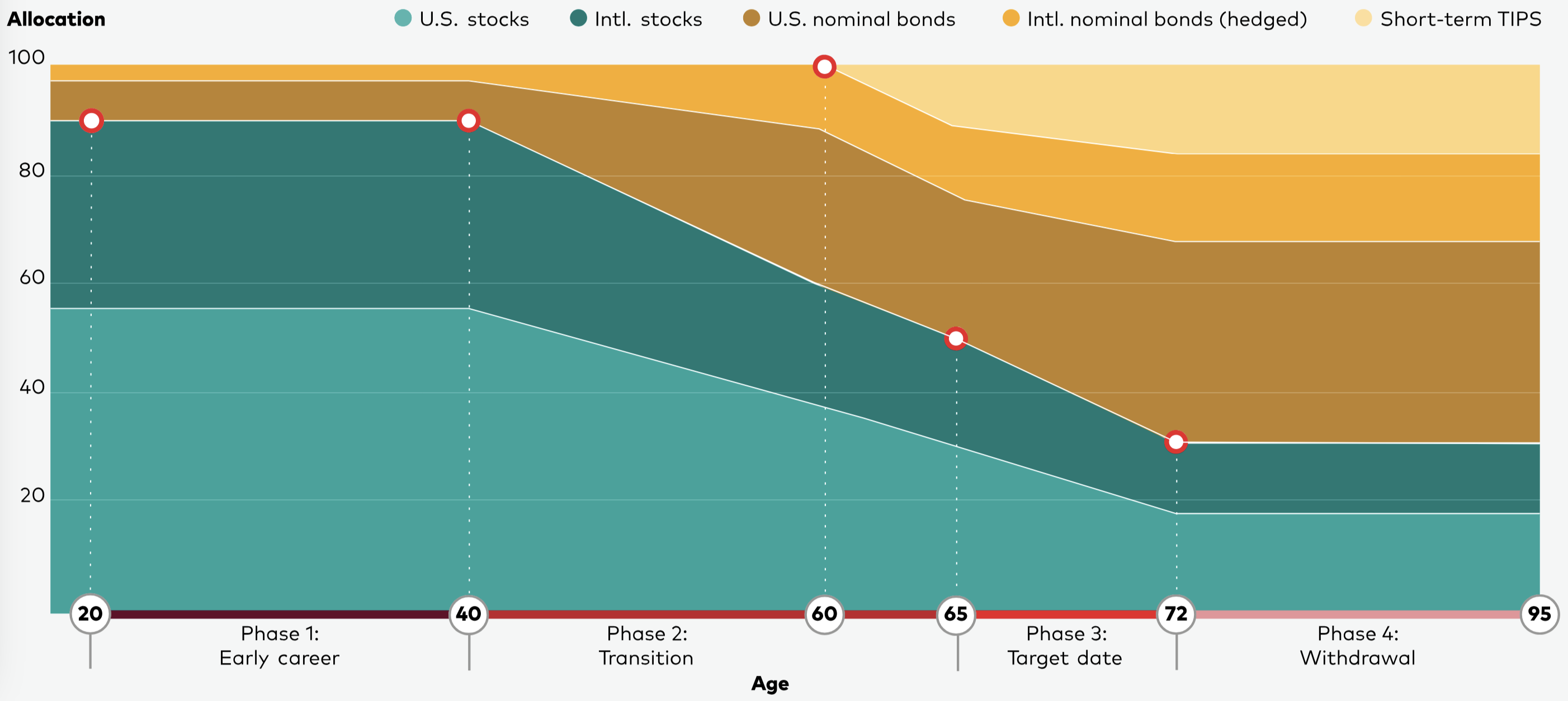
How did I arrive at a 35% allocation and recommend 35% to 70%? Fresh out of school, starting my career, and devouring investment books like the Intelligent Investor and a Random Walk Down Wall Street, I feel in love with index funds, and for good reason! So, in my early 20s I effectively invested 100% of my investable assets into the available 2055 target date fund in my 401K (thanks Chris for ensuring it was a good offering!). This worked out great for the first 5 years or so, especially as the market performed well. But I got a bit lucky that there were no significant downturns in that time. After saving up more money, getting married, buying a house, and thinking about having kids… I realized I needed some of my investments to be “safer” and accessible for life events and peace of mind which led me to the 70% recommended allocation with the remaining 30% between all-weather (next topic) and cash. But then once I discovered dual momentum (two topics from now) I personally dropped my allocation to 40% to make room for dual momentum. But it’s up to you, your interests, and comfort level. If you’re like me and want to be able to add some of your own flare to your investments, at least keep 35% in target index funds. If you want the easiest portfolio strategy possible, go big on target date funds! But don’t exceed 70% to be able to use an all-weather portfolio for some stability when the target date funds go through some inevitable long cycles of low or negative returns.
Use an “All-Weather” Portfolio to Stabilize Your Returns and Give You Peace of Mind
Target date funds will perform great for the full duration of your savings timeline (~45 years) but they will be quite volatile throughout that time. Some years they may return +20%, others they may lose that much or more. Not only will it bounce up and down annually (and even more exaggerated volatility when paying attention more regularly throughout the year like monthly, weekly, even daily), they may lose money for several years in a row, especially when accounting for inflation. Seeing your hard earned savings seemingly erode is hard, no matter how young you are and how much conviction you have that they will rebound (which they will). You need a portion of your overall portfolio of portfolios to be something you can depend on. You need a portfolio stabilizer.
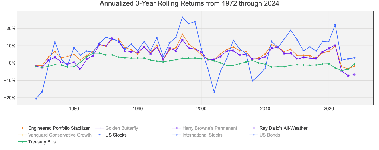
Let’s illustrate this point by plotting the rolling three year annualized real returns (accounting for inflation) of US stocks from 1972 (first data point in 1974) through the end of 2024. We’ll compare this to treasury bills (cash), and I’ve introduced two other lines: Ray Dalio’s All-Weather portfolio, and what I’m calling the “Engineered Portfolio Stabilizer.” Notice that most often the blue line (US stocks) outperforms the orange (Engineered Portfolio Stabilizer) and purple (All-Weather), but not always. And when stocks do poorly, they have done quite poorly, generating in excess of 10% annualized losses for three years in a row. Meanwhile the orange and purple generally stayed steady through those downturns. The time series plot is useful, but next up we’ll plot a bunch of performance vs risk metrics!
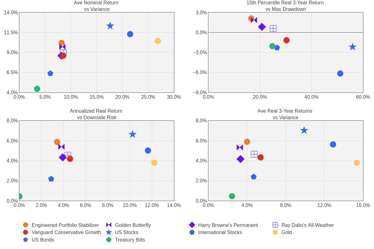
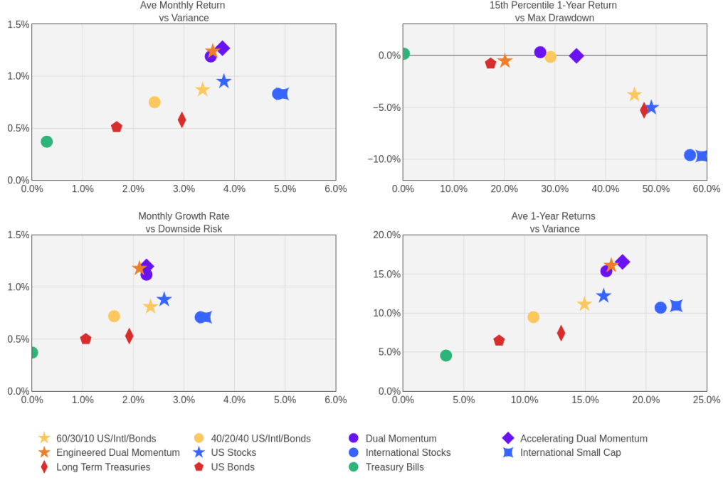
In the below four plots, I compared the performance from 1972 through the end of 2024 for a few stabilizing portfolio options I’ll elaborate on next in purple, a few key asset classes in blue, Vanguard’s conservative growth fund as a benchmark (60% bonds, 40% stocks) in yellow, and US treasury bills in green. I’ve also added in orange the “Engineered Portfolio Stabilizer.” The top left plots the average nominal return (before accounting for inflation) against the volatility of annual returns. You’ll notice that the purple and orange seem to bulge out a bit toward the upper left meaning they offer better risk adjusted returns. This becomes more pronounced when we plot the real (after accounting for inflation) annualized return against the downside risk on the bottom left plot. I prefer looking at the annualized return vs the average return because averages equally weight gains and losses when we know that mathematically this isn’t how compounding gains/losses work. For example, if one year a portfolio gains 10%, the next year it loses 10%, that average of 0% would suggest it was a wash, you’re back where you started. But you’re not, you are 1% lower. I also prefer looking at downside risk which only quantifies the volatility of losses because an investor typically won’t mind too much about the volatility of their gains. This “bulge” towards the upper left (attractive risk adjusted returns) becomes even more pronounced in the bottom right plot when we compare the average three year return vs the volatility of those three year returns, which you can visually confirm by looking at the time series plot above. Last, but not least, is the upper right plot, which I think is the most compelling, that shows you the worst case scenario. Here I plotted the 15th percentile 3-year return (85% of the time it does better than this) against the maximum drawdown. In order to benefit from the upside of a mostly stock portfolio, you would have had to endure nearly a 60% cumulative loss. And just under 20% of the time, you would have had to endure sustained losses that took longer than three years to recover. That is hard to do my friend! Unless, you had some percentage of your overall portfolio allocated to one of those “stabilizer” options that would have better preserved capital, even gaining, while a more stock-heavy portfolio sustained losses!
So what are these stabilizing portfolio options you ask! There are four I’ve compared here, each hold a sizable amount of gold. If you’re like my younger self, you may have an allergic reaction to the idea of investing in gold. It doesn’t “do” anything, there are no dividends, and no profit generated. It appreciates value because silly humans have decided it’s valuable. That being said… it does appreciate value. And it appreciates most during both inflationary periods and market downturns. So as a hedge to both stocks (that fall in market downturns) and bonds (that fall during inflation), gold is quite the hedge! One of my previous posts highlighted this: Solving the Great Diversification Debate. Note that this is only true in a portfolio that rebalances regularly (assumed annually in these plots). I minimize tax implications by rebalancing via contributions (adding to under-performers) and withdrawals (selling off out-performers).
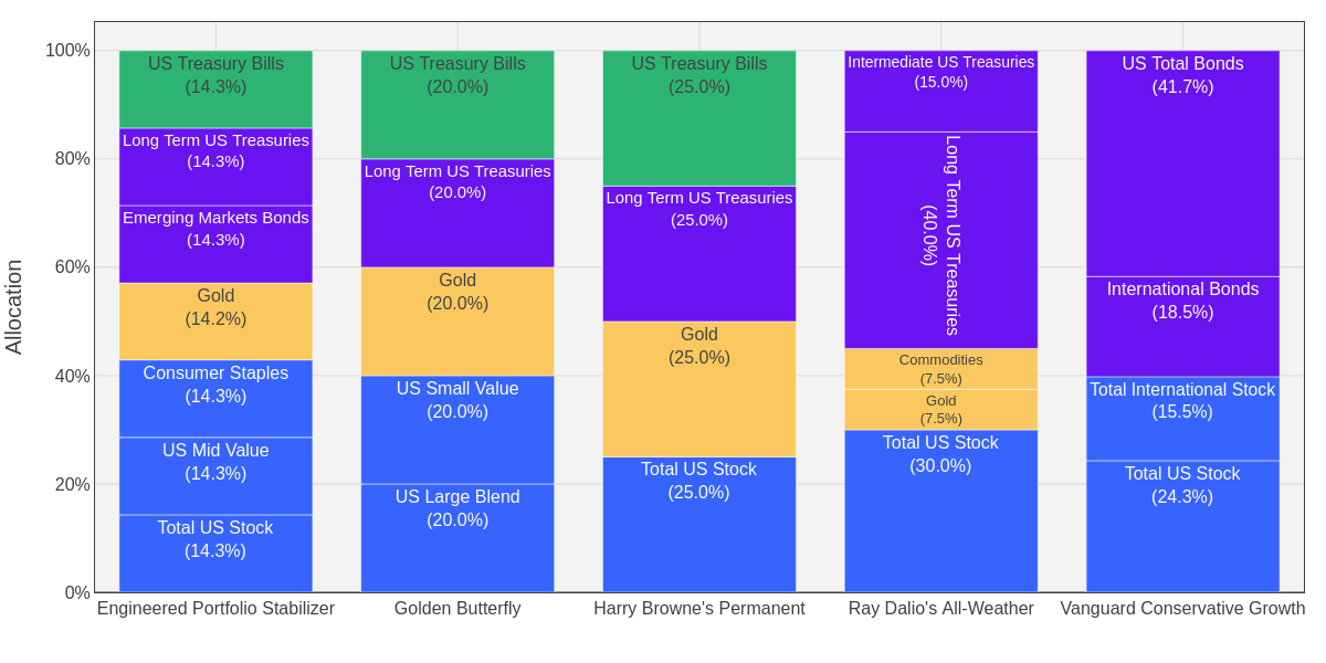
Figure 8 compares the asset mix of each portfolio. Harry Browne’s “permanent portfolio” is the simplest with just four equally weighted assets. Tyler’s (a fellow mechanical engineer who loves investment plots) “Golden Butterfly” is attractive in that it’s just 5 equally weighted assets and effectively matches our “engineered portfolio stabilizer.” Then Ray Dalio’s “All Weather” also has 5 assets but it weights 40% to long term treasuries which did great over the last 30 years but… I don’t think it will repeat as yields rise. Our “Engineered Portfolio Stabilizer” equally weights 7 assets which include our loved consumer staples (see sector analysis), mid-cap value (see style analysis), and emerging market bonds (see bond analysis). You could also consider Vanguard’s conservative growth fund which is a “safe-ish” portfolio stabilizer but it doesn’t have gold so its effects are muted.
How did I arrive at a 35% allocation and recommend 15% to 50%? When I was younger and dumber, I would give Chris a hard time about not investing wholly into stock index funds. I thought he was old and too risk averse… come to find out he was wiser than I. As I mentioned, once I bought a home(s) and had kids, I realized that life can present itself with more expensive unforeseen costs than I thought! Homes require work, sometimes benefit from improvement projects, and sometimes require moves to larger homes to accommodate a growing family (four kids!)! Having some liquid-ish capital that you can depend on both appreciating while also not suffering major losses is a must. I recommend everyone hold a portion of their investable assets in a “stabilizer portfolio” and it’s up to you which portfolio you utilize. You may prefer the simplicity of Vanguard’s single fund or Harry Browne’s or Tyler’s which only need 4 or 5 assets. But I prefer the mix of 7 assets that build upon the historical analysis I’ve done and therefore give me conviction on the assets. Having more assets also improves the ability to dollar cost average underperforming ones as I contribute money or outperforming ones as I withdraw money. Up to you on what portfolio mix you use, but I strongly recommend you come up with something you’ll have conviction in and keep at least 15% of your investable assets in. As you near retirement, you may want an even greater allocation here, to as much as 50%, to provide the stability and peace of mind you need.
Benefit from a Momentum’ Strategy’s “Different” Movements
When I started diving into researching historical asset performance characteristics, I intended to find an “optimal” combination that provides the best risk adjusted returns. I fully expected to develop a “buy and hold” strategy. But the more research I did to this end, the more I noticed that assets tended to go on “runs” either up or down that persisted for years at a time. And so I became interested in momentum strategies that used rules to predict which assets would continue such runs, knowing that such predictions would sometimes be right and sometimes wrong. But could there be some strategies that were right more often than wrong?
This led to me developing and publishing a strategy I called accelerating dual momentum. I initially developed it by looking at data going back to 1998 and trying to avoid much of the losses in the bear markets of the early 2000s and 2008. I also wanted to benefit from the relative outperformance of international stocks in the late 90s and mid 2000s. It averaged the 1, 3, and 6 month trailing returns to pick which asset to buy the next month: US stocks, small cap international, or long term treasuries. I then found monthly data going back to 1871 and applied the same methodology on this “out of sample” dataset. I was relieved but even more excited to find that the accelerating momentum signal had worked very well going all the way back to 1871 as shown in Figure 9!
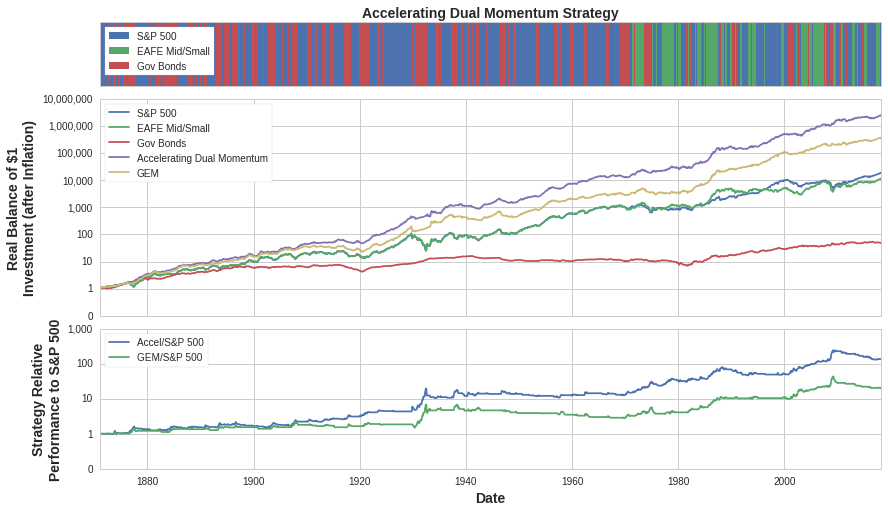
This performance and the rationale for the strategy generated global interest and many others shared the strategy and published articles reviewing its merits. TuringTrader added some performance characteristics and recommended it as one to follow. And AllocateSmartly gave a fair assessment that highlighted some of the risks while also acknowledging its merits. It even generated a response from Gary Antonacci, the author of the book Dual Momentum Investing, in an article he titled “the perils of data mining.” I found that framing somewhat comical because he arguably did the same thing but oh well. I was proud that it generated enough interest that it compelled him to dispute the strategy’s approach.
It’s been 7 years since developing and publishing that strategy in which time I’ve live traded it with my own money. How has it done in this out of sample testing! It tied Gary’s strategy from May 2018 through January 2025, each returning a cumulative 83% return and beating a 40/20/40 US stocks/international stocks/bonds portfolio that returned 67%. But they lost to a more stock heavy portfolio of 60/30/10 which would have returned 99% during this bull market period. But what have I learned about the ride!?
- The strategy is hard to manually follow. You need a lot of conviction to make the wholesale switches from one asset to another which can happen often with the short lookback periods.
- Whipsaws are frustrating and defeating. To switch out of an asset then back in again the next month lowers your conviction in the strategy’s approach.
- Long term treasuries don’t always rise when stocks fall, especially when rates are rising. It’s depressing to rightly predict stocks will fall and get out of them, but then to be in an asset that falls just as much or even more.
I’ve been meaning to make some improvements to the strategy for a while. And I’ve been recommending cash instead of treasuries to those subscribed to my newsletter in a rising rate environment. So the strategy, if applying rules to pick between treasuries and cash, would have beaten Gary’s in out of sample testing (take that sir!… I’m teasing). But we need some rules to make decisions on data, not intuition, and we need to address the other issues I’ve faced live trading (like whipsaws). Writing this post has finally motivated me to make some modifications to introduce a new strategy called “Engineered Dual Momentum!” Here are the changes and Figure 10 gives an overview of the monthly allocation decision.
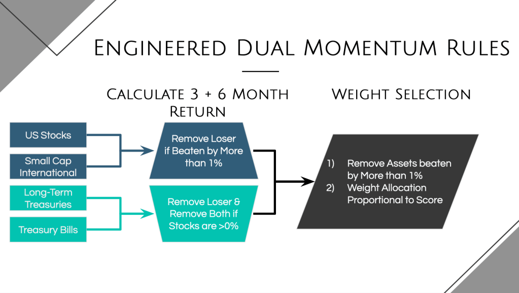
- Just use the 3 and 6 month momentum score. Drop the 1 month component to reduce whipsaws and limit and asset switches.
- Split the allocation across multiple assets when they have a “close” score to hedge our bet and diversify within a month. Weight the allocation proportional to the score but only split across multiple assets when there isn’t a clear winner (defined as having a score at least 1% greater than the next best).
- Introduce treasury bills to allow us to avoid long term treasuries when they have a low momentum score.
- Soften the impact of the absolute momentum decision (if negative, automatically go bonds) by using the logic in #2 so that if it’s just slightly negative we don’t fully leave stocks.
- [To Do] Move my IRA (you should only use such a momentum strategy in a tax free account) from Fidelity to Robinhood so I can automate the transactions via Python. This will be the subject of a future blog post so I can share the code. Maybe someday Chris and I could offer a paid service where our app integrates with each subscriber’s Robinhood account to perform the trades automatically for a modest fee ($5/month, tier up or down based on account balance).
So how has it done! Let’s first check the results from the start of 2008 through March of 2025 in Figure 11. Our new EDM strategy clearly stands on its own for its risk adjusted returns. But admittedly this is the period I have lived through and may have overfit the rules for.
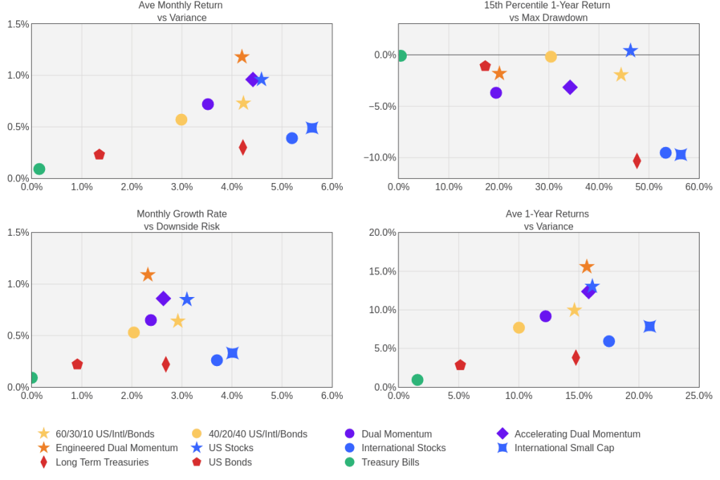
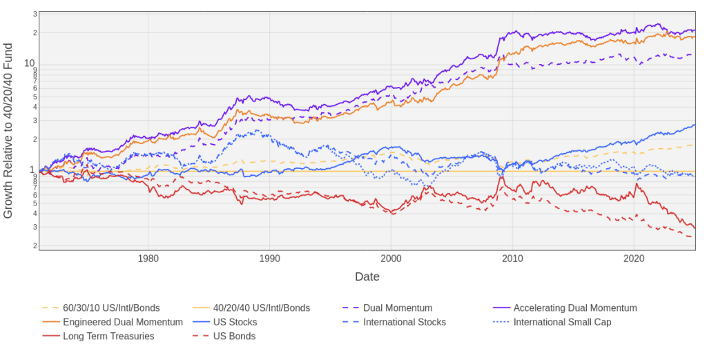
So how did we do through a longer look back period? Using data from 1971 through today, we can plot how the different strategies performed relative to a fixed allocation of 40% US stocks, 20% international stocks, and 40% bonds in Figure 12. Then Figure 13 summarizes the results using our portfolio characteristics metrics. The three momentum strategies performed pretty similarly with Accelerating Dual Momentum doing the best (21x the benchmark) followed closely by Engineered Dual Momentum (18x the growth relative to the benchmark). Gary’s strategy isn’t too far behind although its returns are only 13x the benchmark. When I did some of my initial development of accelerating dual momentum, all I cared about was the final balance. But I’ve since come to learn that the ride itself matters more because you need to weather the ups and downs and past results are by no means a predictor of future returns. So I think this data suggests, if you’re interested in dual momentum, you need to select whichever strategy resonates the most with you and what you think you’ll be able to follow. Relative to our benchmarks these strategies offer the potential to provide similar risk in terms of volatility but muted maximum drawdowns and sustained periods of losses. Yet this improved risk profile still allows, historically, to have beaten the benchmark’s returns… if you can stick to it!
How did I arrive at 22% allocation and a 0% to 30% recommendation? I think momentum strategies clearly have an opportunity to outperform over the long run and therefore deserve an allocation in your portfolio of portfolios but… they won’t always outperform and they require work. You shouldn’t allocate anything to these strategies if you don’t want to spend the ~10 minutes each month to check and make the trade (if necessary) -> at least until Chris and I create an app that does the work for you! If you are interested enough to be willing to spend the time, its still best to not have more than 30% in these strategies which can go on runs of underperforming. If you keep the allocation to less than 30%, you’ll provide yourself with good diversification benefits and won’t be too much of a weighting that would give you heartburn and frustration during those periods of underperformance. Then its up to you to decide which strategy you like best. I prefer the Engineered Dual Momentum strategy that balances being reactive without being too whipsaw-y. But you may like the aggressiveness of Accelerating Dual Momentum or the simplicity of regular Dual Momentum. Its up to you!
Scratch Your Itch with a Small Mad Money Account(s)
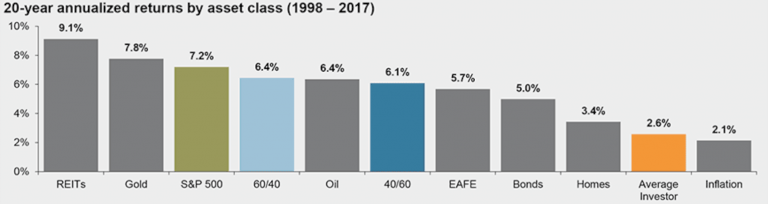
If you’re reading this blog you probably have enough of an interest in investing that you may find it enjoyable and potentially lucrative to pick and time your own investments in individual stocks, crypto, options, etc. instead of the aforementioned passive and rules based strategies. This is why I have my rule #2: keep it simple yet fun! You should give yourself that opportunity but for a small percentage of your overall portfolio. Why small? Because individual investors typically underperform against the overall market. Most studies I’ve read claim that the average investor realizes less than a 3% average return, see Figure 14. And even professional funds underperform (hence the suggestion to invest most of your portfolio in target date funds) on average by 2.8% relative to their benchmark (source).
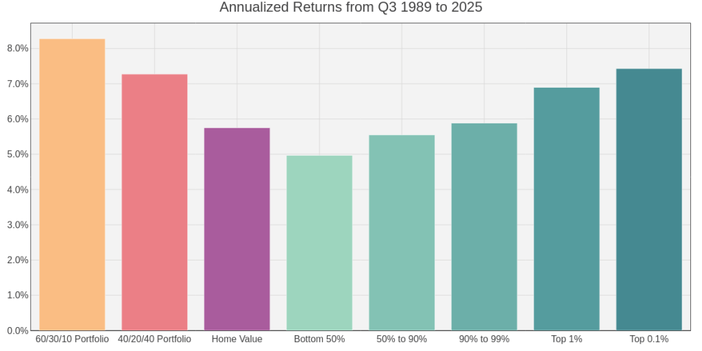
Less than a 3% annual return seems abysmal and possibly under estimated given the typical source: investment companies that want you to pay them to invest for you. So I wanted to find a different data source looking at how the net worth of Americans have grown over the years relative to the market. Figure 15 plots the net worth gains for the bottom 50%, the 50% to 90%, the 90% to 99%, the top 1%, and the top 0.1% while also including the value of owner-occupied real estate in the US and our benchmark portfolios. And Figure 16 compares the annualized returns for this time period of Q3 1989 to now. I know that net worth gains will also include cash flows of savings and withdrawals, but I was surprised that the gains of the net worth of the top 0.1% don’t even beat the gains if invested fully in a portfolio of 40% US stock, 20% international stock, and 40% US bonds.

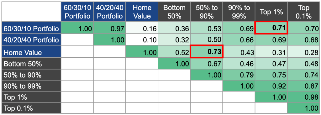
I found it interesting, and validating to using net worth as a proxy for determining average investment gains, by noticing how the total amount of the 50% to 90% net worth Americans tracks closely that of home values whereas wealthier Amercian’s net worth correlates more to the stock market. This suggests that 50% to 90% Amercians have their home representing a large percentage of their overall investment portfolio compared to wealthier Americans having more exposure to the stock market than their home(s). Figure 17 provides a correlation matrix across all net worth percentiles and the benchmark portfolios by looking at the trailing 1-year gain. Again, the net worth gains isn’t the best proxy and it includes a lot of other factors such as income and spending that may outweigh the impact on investment performance. But I think this provides a useful grounding as to how well we collectively do investing. And it reminds us that even the ultra wealthy are barely beating a 60/40 stocks/bonds investment allocation meaning that typical investors are either too conservative or making poor investment decisions throughout the year. Be wary of a high allocation to “mad money” accounts when you’re trying to pick and time your own investments! You could beat the ultra wealthy in investment returns if you just stick to passive rules based investing!
How did I arrive at a 3% allocation and a 0% to 15% recommendation? I fully recognize that I’m unlikely to beat passive rules based investing meaning I have very little in a mad money account (Robinhood). Here I own some crypto and a couple stocks I’m holding for the long run. I like to have fun and be interested in my investments, but right now I’m at a point in my life that I don’t have much time to spend researching investment opportunities, hence all my focus on rules based investing. I expect that to change as I get into my 40s and 50s though and will allow myself to allocate as much as 15% into these accounts… so long as I track my performance and prove to myself it’s worthwhile. You know yourself best so put in an amount you will feel comfortable using. And again, hold yourself accountable by comparing the performance of these accounts vs the other parts of your overall portfolio!
Put Cash to Work, But Not Enough to Drag Your Returns
Now we’ve made it through the “fun” investment portfolios leaving boring old cash. But who says your cash component needs to be boring, I think it can and should be just as fun and interesting!
Keep 3 Months Worth of Spending in a Liquid High Yield Savings Account
It’s important to have some cash directly tied to your checking account for fast cash in the event of an unexpected expense but that money should still be working for you. Figure 18 shows the interest rate of typical bank accounts (orange) vs what you could get in two high interest savings accounts: Ally Savings and Popular Direct Savings. I’ve also included the interest rate on 3-month treasuries as a benchmark. I first opened an Ally savings account back in the early 2010s when they offered 1% and most savings accounts were effectively 0%. As interest rates when up in late 2010s, Ally and Popular Direct tracked that of 3-month treasuries. Then, when the Fed dropped rates, these high interest accounts lagged providing better return, but still less than 1%. Now over the last 5 years though 3-month treasuries started paying out 5% interest. This is free money! Meanwhile Popular Direct did well to track that, but Ally savings started under-performing. All the while though, a typical bank savings account was still only paying 0.5% or so. The takeaway here, is that you should be weary of keeping any money in a bank account that can’t near match what 3-month treasuries do. But if convenience is super important, then make sure you haven’t parked much money there, invest anything over 3 months worth of expenses in “cash equivalents.”

Keep Excess in Cash Equivalents, Not Sitting in a Bank
As the last plot showed, ultra safe 3-month treasuries offer a pretty attractive rate of return, better than even the most competitive bank accounts. And that’s because your bank account is investing in those treasuries, yet they need to make money too – so cut out the middle man and invest in those cash equivalents directly!
In Figure 19 I’ve compared 3-month treasuries, 2-year treasuries and ultra short corporate bonds which all can be invested in directly with the following ETFs: SGOV for 3-month treasuries, SHY for 2-year treasuries, and PULS for short duration corporate bonds. Notice that the corporate bonds took a 3 month drop of 5% from March through June of 2020 at the start and shock of Covid. It did recover and since has continued to outperform government treasuries, but there’s clearly an added risk here. The longer duration treasuries don’t look attractive though, they may be in some environments, but they will generally have more exposure and risk that generally doesn’t compensate you with proportionally higher returns than just investing in 3-month treasuries.
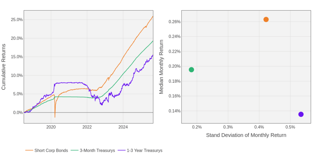
I invest the excess cash over 3 months of expenses that make up 5% of my investable assets directly into those two ETFs, SGOV and PULS. They may not be as convenient as a bank account tied directly to your savings, but I can sell and transfer the assets to my account within 3 days which is plenty fast enough for emergencies. That’s why I wouldn’t recommend keeping more than 3 months expenses in bank account as cash savings. You’re going to be leaving potentially 1% of free interest payments on the table, and those interest payments from US treasuries will be tax free unlike dividends from a bank.
Deploy Cash During Market Downturns
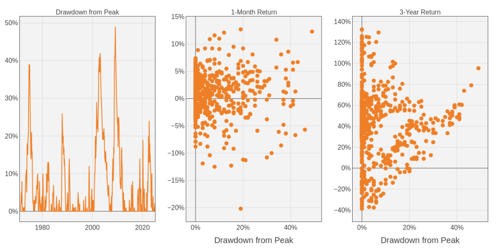
But how much cash should we hold, and should we be willing to deploy it in market downturns? To answer that question, let’s start by plotting drawdowns of the S&P500 over time in Figure 20 comparee to how well the market performed in the following month and following 3 years. There have been some rough downturns as we’ve discussed before in the “portfolio stabilizer” section that didn’t have any correlation to how well the market performed the following month. But notice there is some correlation to larger drawdowns tending to signal larger 3-year returns that follow. But that correlation certainly isn’t perfect and the highest 3-year returns of over 100% have all been off of peaks the market was already making.
But can we use the drawdown as a signal to deploy cash? Figure 21 shows the returns of a fixed and dynamic cash allocation model. Using the S&P500 drawdown as a signal, I created the following rule:
- Deploy 30% of cash when at a 10% drawdown
- Deploy 60% of cash when at a 20% drawdown
- Deploy All of your cash when at over a 30% drawdown
This model requires a means of replenishing cash reserves so I used new money, indexed at 10% of the market to grow over time too. So you’ll see the dynamic scenarios (at either a nominal 5% or 10% cash reserve) dip down in cash allocation at peak market downturns, while actually the fixed allocation scenario see cash allocations spike as a percentage of overall net worth.
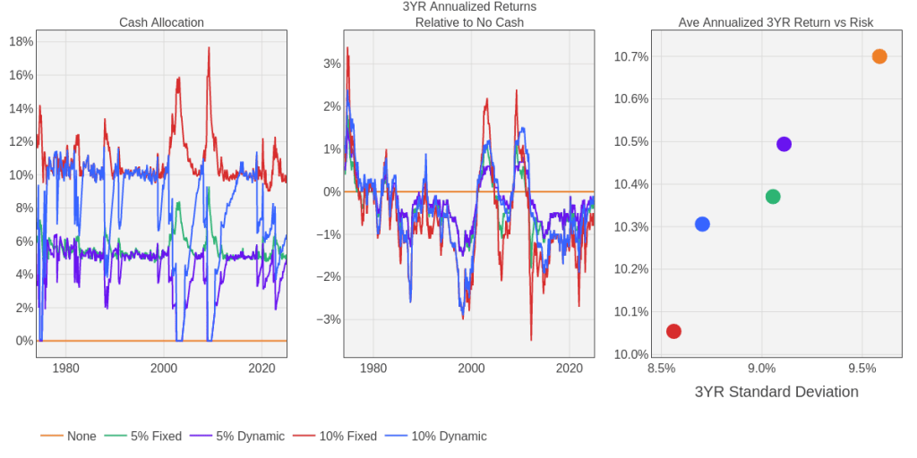
So what did I learn in this? Well, no “cleverness” can overcome the drag on performance holding cash will cause. But the dynamic approach does lessen that drag impact while providing some reduced volatility and peace of mind. The average 3 year return for being fully invested (remember this isn’t a 1-to-1 with investment returns because I’m injected new cash every month) was 10.7% with a standard deviation of 9.6%, a Sharpe ratio of 1.12. But the 10% dynamic model reduced returns by 0.4% while reducing volatility by 0.9%. That is proportionally higher reduction in risk than reduction in overall return, especially when compared to the static allocation that sees returns drop by 0.6% and risk drop by 1%. So, I’ve answered the question that I should be deploying cash based upon market downturns but I’m still torn on what my baseline cash allocation should be.
How did I arrive at a 5% DYNAMIC allocation and a 0% to 10% recommendation? Hopefully the dynamism just discussed looks compelling and suits my tendency to want to “act” (rule #2, keep it simple yet fun). But being invested is still better in the long run and that portfolio stabilizer allocation is a pretty compelling risk adjusted return generator. I had been planning to stay at the dynamic 10% allocation since I started working at Amazon where I have very peaky compensation tied to stock performance (and prior to that I was at 0% cash other than the 3-month target in high interest savings). But after doing this analysis, I’ve lowered my cash allocation down to 5% and seeing both how much of a drag it can be while being reminded of the attractiveness of the portfolio stabilizer account. The trouble is, how do I reduce this allocation… my plan is to wait for the triggers based on downturn then to not replenish back up to 10%, keep it at 5%… unless I get a big cash influx.
Apply Dollar Cost Averaging to Overcome Your Hesitancy… If You Need It
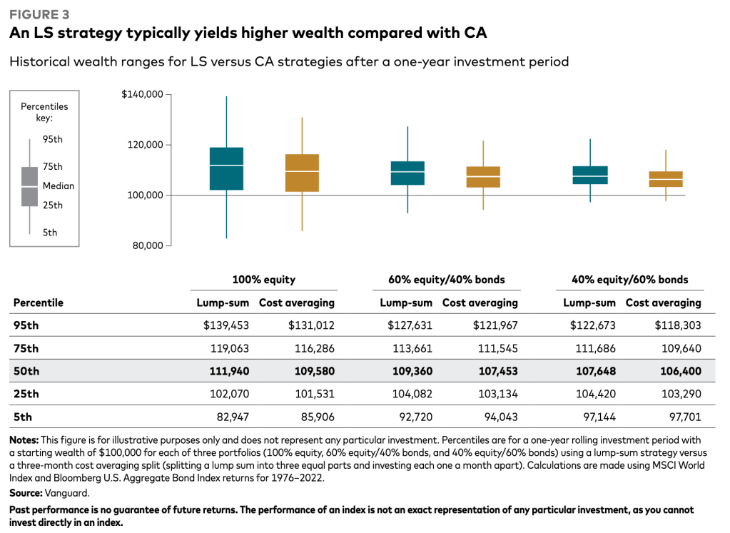
So what happens when you either get a big payday (gift, bonus, inheritance, etc.) or have a big expense (home, renovations, etc.)? Vanguard published a really insightful article on Cost Averaging which I’ve included an image of in Figure 22. Because the market tends to be going up, dollar cost averaging (the act of breaking up the lump sum investment into 3 equal parts and investing a month apart) underperforms 95% of the time. And that underperformance is typically several thousand dollars on a $100K base. That is a big price to pay!
But that same article goes on to discuss individuals’ own risk tolerance and their aversion to loss. It can be hard to get a bonus for example, invest it all, and then see it drop. You may be so afraid of investing at the wrong time you don’t invest ever, or take too long! In which case dollar cost averaging can help you work through your own inertia and fear of loss. It forces you to put some of it to work immediately, while having peace of mind that you have more to deploy if/when the market drops. But if it keeps going up, then at least you have some in there benefiting from that. So I’m trying to train myself to do lump sum investing when I get a bonus but… its hard for me to work through that fear and I’ve still been doing the dollar cost averaging. But I’ve noticed that I then sometimes slip up in timely investing the other chunks. So I think the next time I get a stock vest, its all going straight into investments!
Live a Life Worth Living in an Appreciating Asset
Ok, we’ve made it through all the major allocations of your investable assets! Or have we? I’ve ignored the amount of home equity in the above allocation breakdown which leaves out a significant portion of most people’s overall net worth, their home. To establish what the value of home ownership is for increasing one’s net worth, we need to compare it to the alternative, renting. And we need to estimate how much the home will appreciate in value. We need data! Thankfully Zillow has a sweet dataset they share which I’ll use to establish some underlying assumptions.
Consider the Home Ownership and Rental Costs in your Desired Real Estate Market
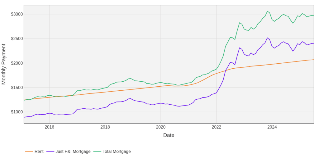
When buying a home you will have a mortgage to pay off the loan principal and interest while also paying for taxes, insurance, and general home upkeep (potentially HOA fees too depending on the building). Whereas a rental payment has just one component, plus utilities which you’d need to pay as an owner too. Figure 23 plots average monthly rent costs in the US compared to the average monthly mortgage (assuming 10% down payment) and a “total mortgage” that includes insurance, taxes, and upkeep. From 2015 through 2021, the average total mortgage payments were pretty comparable to rent costs meaning on a monthly cash flow basis owning a home wasn’t more expensive, yet it had the benefit of some of your costs going to principal. But this was an era of abnormally low interest rates (some have 30 year mortgages below 3%) which have now jumped up to more typical interest rates above 6%. This now makes the monthly cost of owning a home typically higher than renting which adds some nuance to determining which is best for your long term net worth gains. Before we move on, I just want to also highlight that the delta between a total mortgage and just the principal and interest payment tracks about 28% of what rent was, even after the spike in interest rates. So we can use this as a proxy for estimating insurance, taxes, and upkeep moving forward, yet it’s still just an assumption.
Adding more nuance to the comparison of home ownership to renting is the fact that each real estate market has different home values, rental costs, and trending value/cost appreciation rates. Figure 24 plots the top 10 markets over time that shows that the general trends all correlate but have vastly different starting values and they vary over time slightly differently.
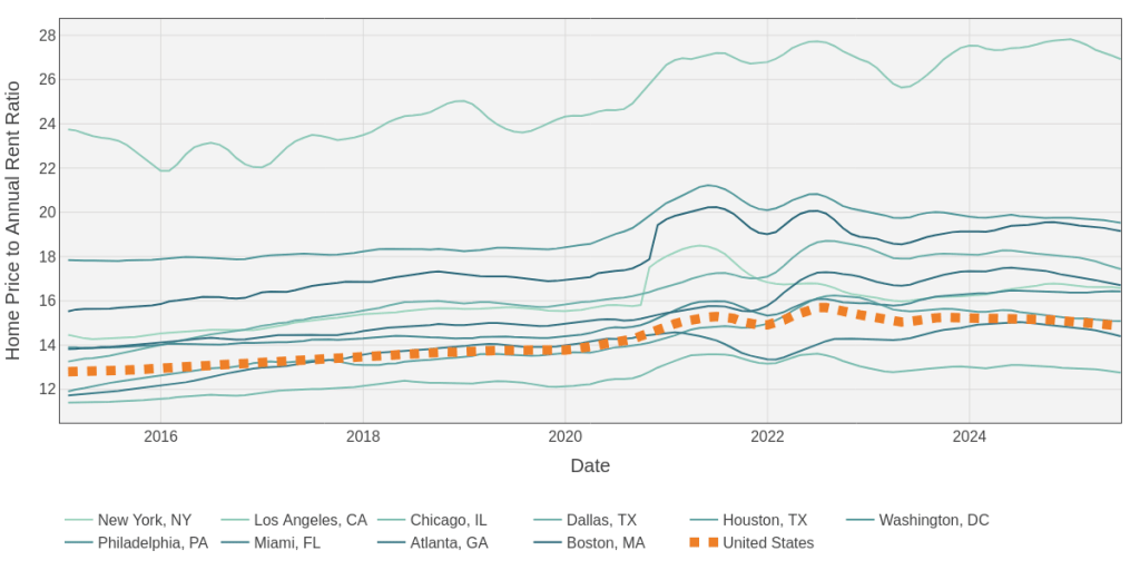
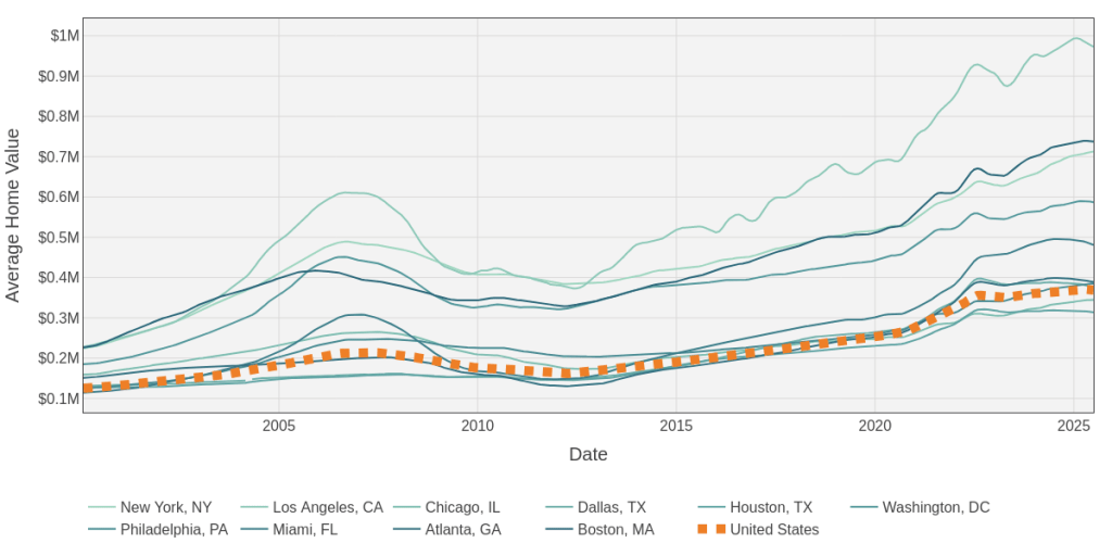
Fig 24: Changing Home Prices and Price to Value Ratios for the Top 10 Markets (Zillow Source).
Zillow provides stats on over 900 different cities across the US which I’ve reduced to the top 100 in the plots in Figure 25 that compare several key assumptions which impact the decision of ownership vs renting to maximize your net worth. The Google Sheet (tab Price-to-Rent-Summary) I’ve been using for collecting all data presented in this blog summarizes these markets all ordered by population size. You’ll notice there’s a loose trend between home value metrics and rent metrics, but they vary wildly by different cities, some being much more favorable to home ownership and some being more favorable to renting. The Google Colab I’ve been using for all plots lets you hover over different dots to see which city is which.
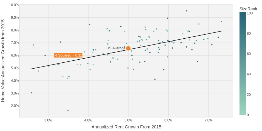
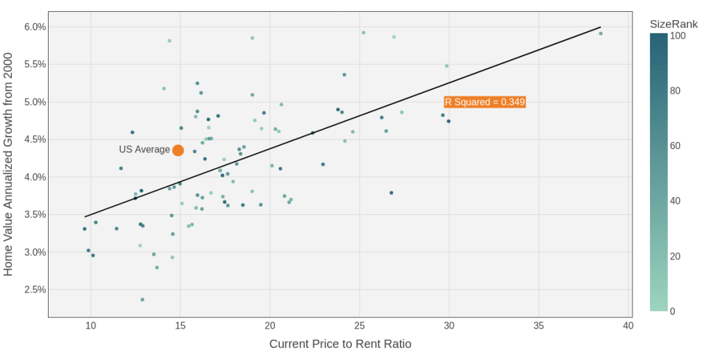
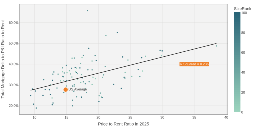
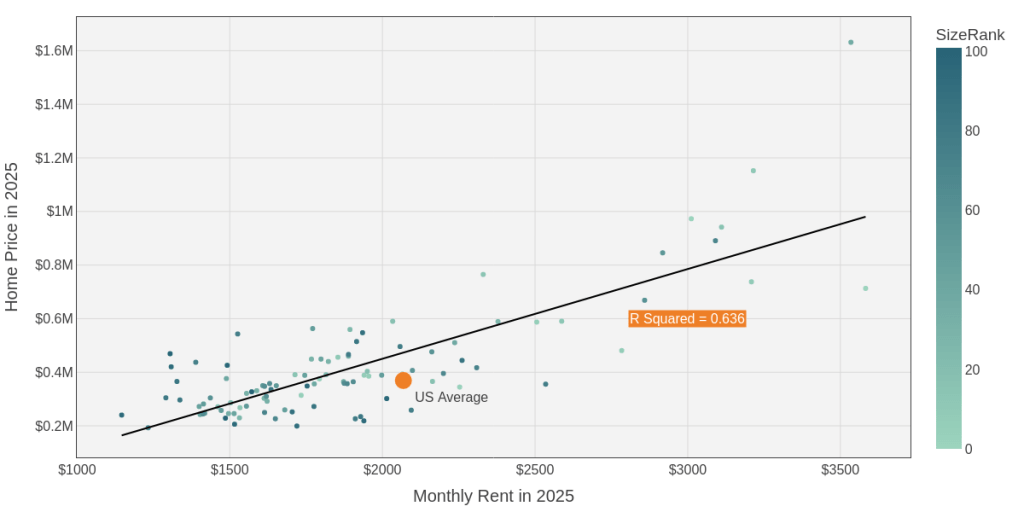
Fig 25: Comparing the Top 100 Markets by Population on Key Assumptions (Google Sheet Source).
Project Your Net Worth Growth from Buying a Primary Residence vs Renting
Let’s build a calculator! We can use the Zillow data for key assumptions on the real estate market (home price, price-to-rent, expected home value appreciation, expected rent appreciation, and total mortgage costs). But we also need to account for the interest rate we can expect from a mortgage (typically around 6.5% now, mostly derived by rates set by the Fed), how much of a down payment the buyer puts down, and what type of investment return they could realize elsewhere. I built the calculator in the Google Sheet, tab Mortgage-vs-Rent-Cash-Flow-Calculator, which can be visualized in Figure 26 that shows the cash flow plots for both US national averages and then San Francisco. For each they assume a 6.5% mortgage rate, a 10% down payment, mortgage insurance of 1% (until owning 20% of the home), closing costs of 2%, and an expected investment return elsewhere of 6%.
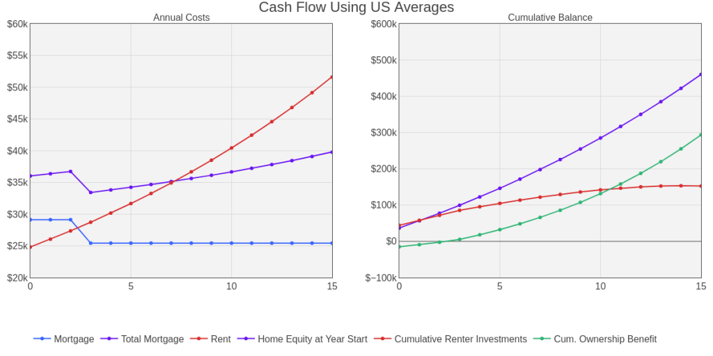
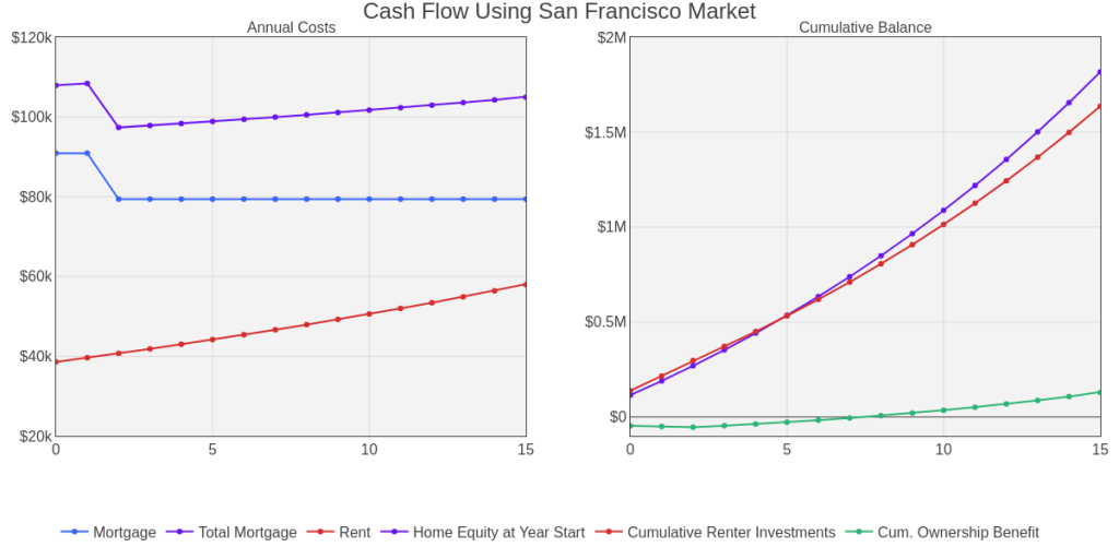
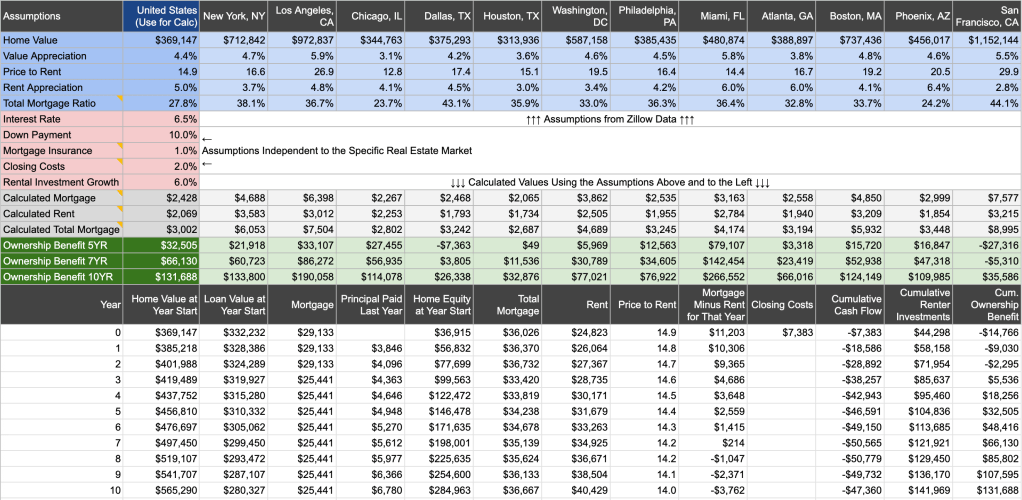
Fig 26: Cash Flow of Home Ownership vs Renting Calculator (Google Sheet) in Top 12 Markets.
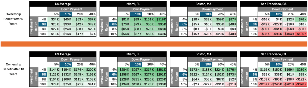
Notice that buying in an average US market is better for your net worth so long as you own it for at least 3 years because the relatively small increase in mortgage costs compared to rent is paid for from the increasing home equity (remember this home equity growth is leveraged because you used debt, that first year of 4.4% price increase equates to a 44% return on your investment when you only put 10% down). And after 7 years, rent costs actually exceed total mortgage costs making the benefit of home ownership start to exponentially rise. But in San Francisco (with the other assumptions we have) it would take 8 years of owning the home to be more beneficial than renting because there is such a large gap between home values and rent costs. And that rental cost increase is only 2.8% per year so even after 30 years the monthly total mortgage cost is more than renting. This means that even with a 5.5% home appreciation and leverage, just renting and investing the money you’d save relative to home ownership is able to keep pace with the increasing home equity you’d have for owning. But these conclusions are still dependent on three other key variables: mortgage rate (which you don’t have much control over), your down payment, and the rate of return you can expect from other investments. Figure 27 varies the down payment and rate of investment return to compare the benefit to your net worth after owning a home for both 5 and 10 years compared to renting.
Two big things jumped out at me in this analysis.
- In most markets, home ownership is typically more financially valuable than renting so long as you hold it for more than 5 years. But this time horizons varies by market.
- If you earn more than 6% return on your other investments, there are some markets where renting will be more valuable than ownership, no matter your time horizon.
- If you earn more than 6% return on your other investments, you typically want to minimize your down payment. The reverse is true if you are a conservative investor. This condition holds true across different real estate markets.
The first learning was expected, the second two surprised me. I didn’t realize how dependent your overall investment performance is at determining if home ownership makes more financial sense than renting. It’s much closer than I thought, and requires each of us to really sit down and analyze the financial situation to determine the best approach. But there’s one caveat. This tighter-than-expected relationship is only true at the current mortgage rates. If rates start coming down again, it tips the scales heavily in favor of home ownership. If rates start rising however, many more markets may start becoming financially irresponsible to buy in. Unless…
Decide What Will Bring You More Joy at Your Current Stage of Life
A home provides an opportunity to use and get value from your investment while it appreciates, unlike a mix of stocks and bonds in an investment account. And to me, that makes home ownership a no brainer for what I’m looking for in life for my family. I like the stability, the ability to make modifications/improvements, and we spend a lot of time in our homes. Therefore I’ve always had about 50% of my net worth in our home equity. I keep thinking that number will come down over time, but then we decide to do a renovation or move into a larger home. And the home values have risen faster than my savings rate and growth of other investments. That’s been working for my family and I expect that to continue over time. But you may be someone who prefers to travel, spend little time at home, and move often. And so renting for you may not only align best with your life’s needs, it may actually be better appreciating your net worth… so long as you are investing your other assets aggressively.
Prepare the Next Generation
What would a family investment strategy be without thinking of the little ones!
Pay for College with a 529 Plan
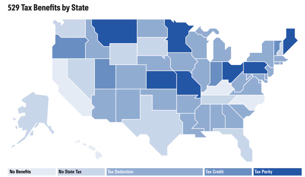
If you have kids, you should open 529 plans to have money grow tax free to pay for their education. Now when I first started having kids I swear that Massachusetts didn’t offer a tax deduction benefit for contributions. Either that or the fees they had I think were around 1% which ended up nullifying the tax deduction. So I opened 529 plans in the state of Utah which had the best funds in my opinion, including some small cap value and emerging markets! Massachusetts has since reduced their fees and are considering increasing the deduction up to $10K. So writing this blog convinced me I need to open at least one account in Massachusetts where I live!
Its up to you and the tax benefits in the state you’re in. This Morningstar article does a good job showing tax benefits by state, Figure 28 shows that in a map. If you’re in a lighter color state, you may want to look around at other states to see if its worth a different investment mix you could get, I still think the Utah one has the best options. But most states now should offer competitive priced target date funds which would be easy and compelling, especially if they also offer state tax benefits.
Teach Your Kids Investing with a Custodial Roth IRA
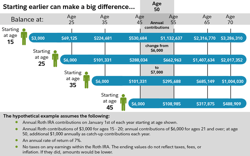
Chris (again older and wiser) reminded me about another investment vehicle for kids (thank you!). Once your child is old enough to start working a part time job (and it counts if they do babysitting or lawn mowing if you document it) you can open and contribution to a custodial Roth IRA. So if they make $3K at the age of 15 for example, you could start investing that amount, up to $7K per year into a Roth IRA. The benefits of the added years of growth are impressive due to the time value of money and compounding returns as shown in Figure 29. If you start contributing $3K a year from 15 to age 20, then $6K from age 21 on, you’d already have $69K saved by the time the child turns 25 with a 7% rate of return resulting in $1.3M more at the age of 70 than if you waited to start at age 25. Not only will this provide a meaningful difference in their quality of life in retirement, this presents an opportunity to start teaching them the value of investing at a young age! My oldest is only 9 and isn’t making any money yet, but once he does, I look forward to opening an account with him and working with him to pick some investment options!
Keep the Discussion and Learning Going!
This post is a doozy getting up to 10K words, sorry about that! If you made it this far, hopefully you found it helpful, let me know! Maybe it will motivate me to do a little webinar and short video to talk through some of the content. And if you want to dive deeper, you can view all the data in this Google Sheet and interactive plots with the Python code that generated it here in this Google Colab.
At the very least, I found writing this post helpful to learn some new things myself and hopefully provide a good foundation for my children to learn from! Most of all, publishing this post should help keep myself accountable to actually following my own guidance!
Look for a future post to share the best ways to track your own performance to help us learn and adapt our approach over time. Till then, happy investing! I hope you both find some intellectual stimulation balanced with peace of mind knowing you’re on the right path growing your and your family’s wealth. But don’t forget my rule #5:
Maximize your impact, not your wealth. Money is a means to an end. Use it or give it away.

Leave a reply to Recent Quant Links from Quantocracy as of 10/26/2025 – Quantocracy Cancel reply